
Aneta Sound
Milena Villalba. Photographer
Jordi Morant. Acústica Profesional Aplicada SL. Engineer
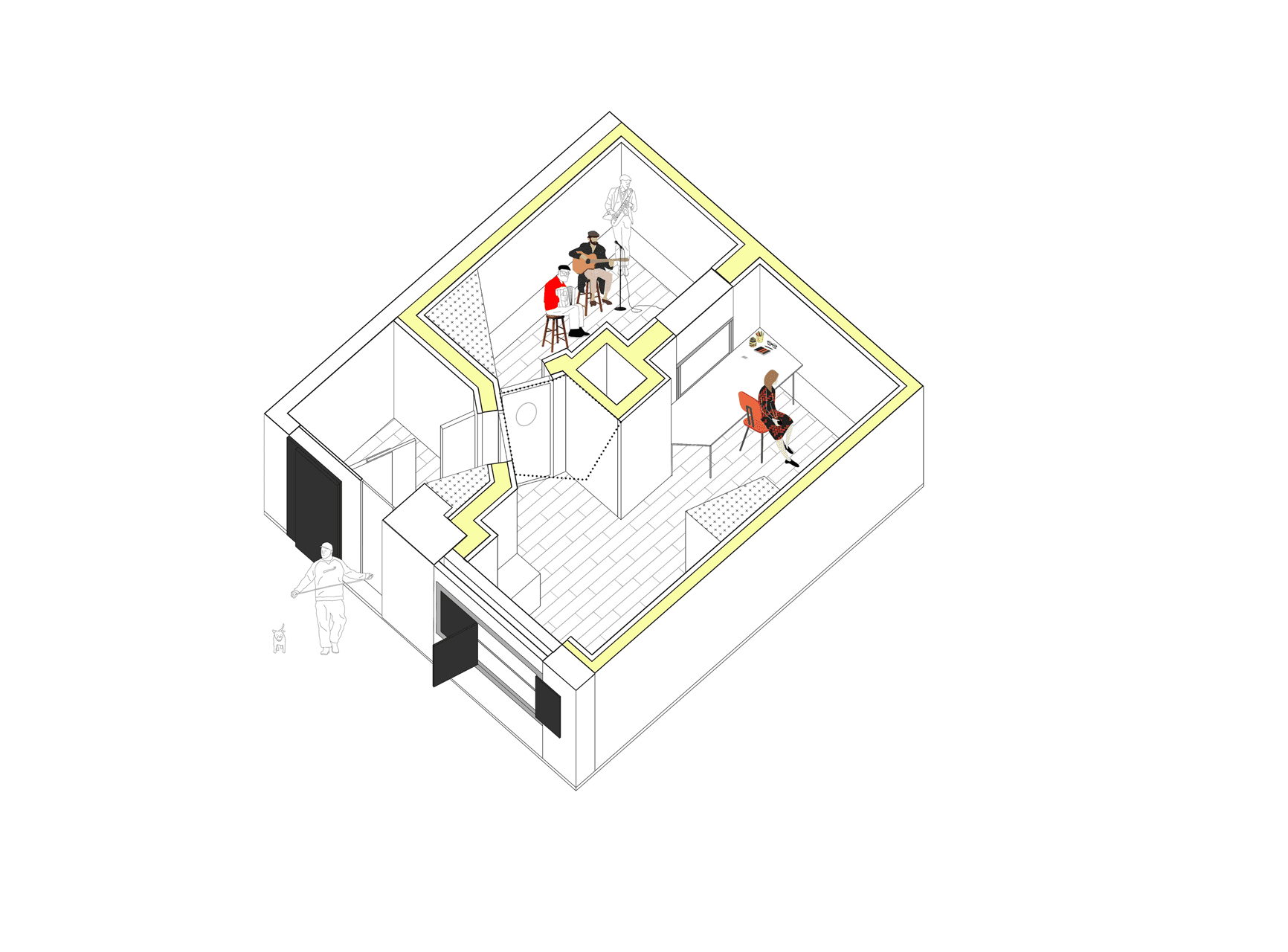
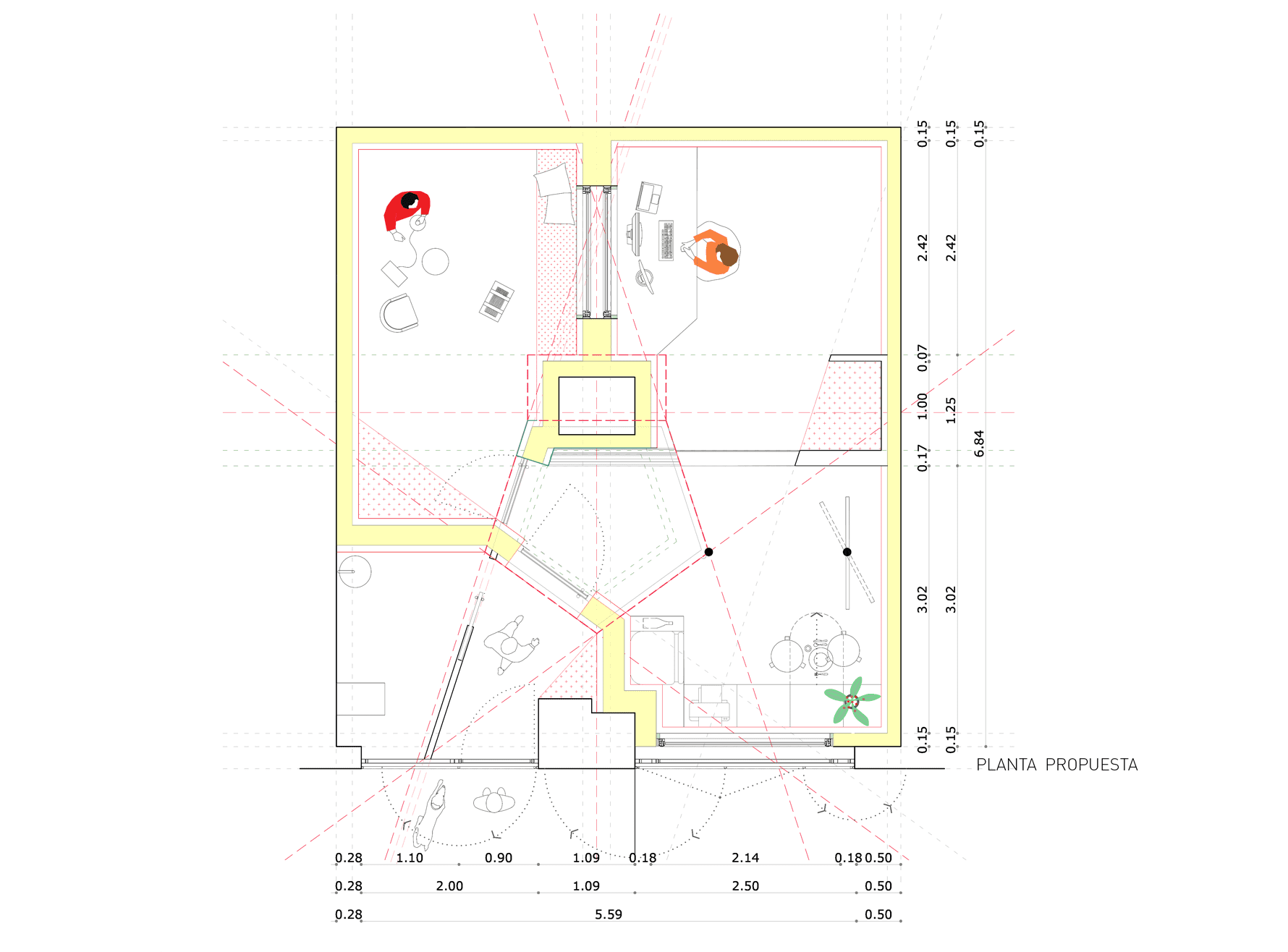
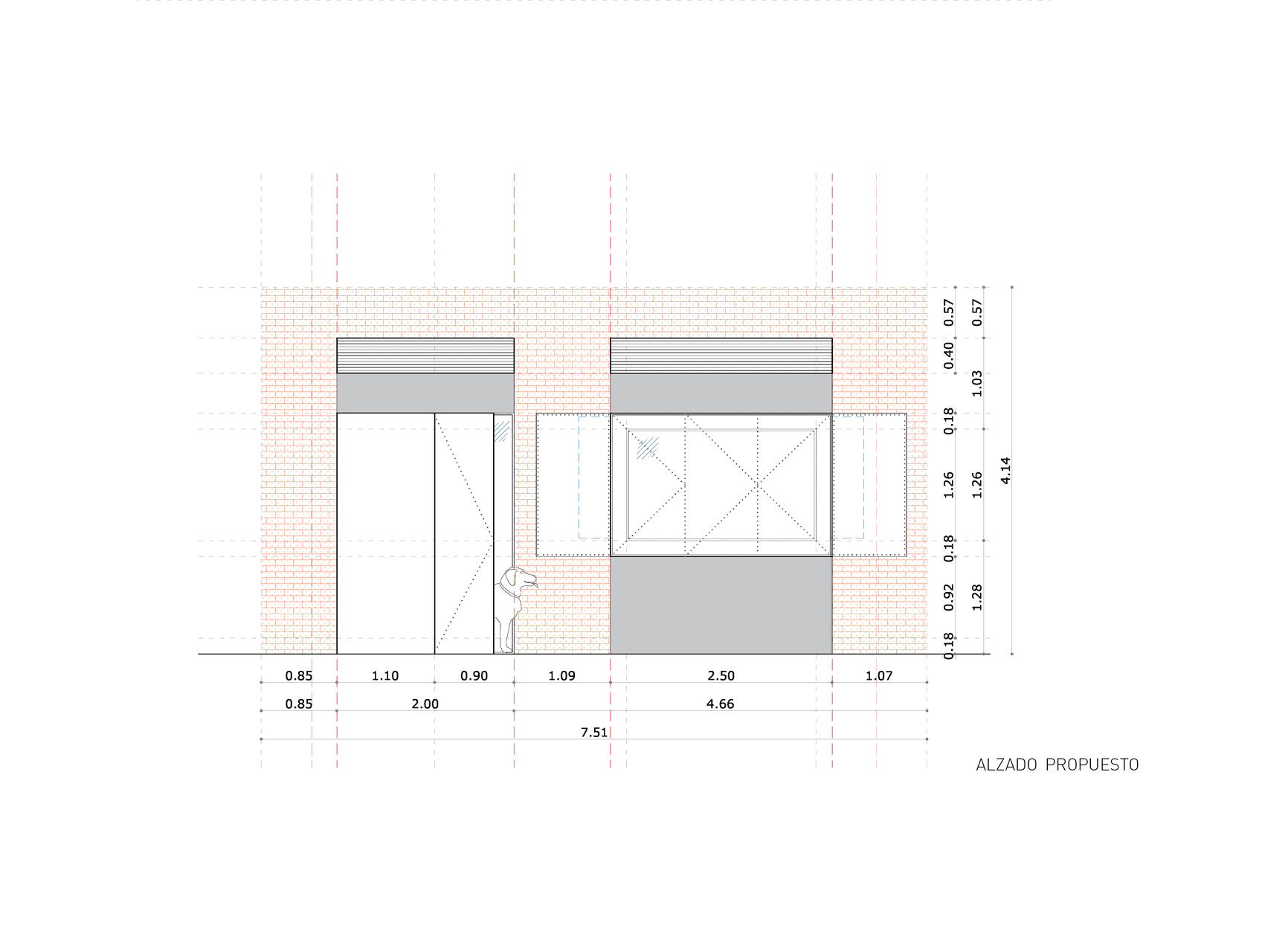
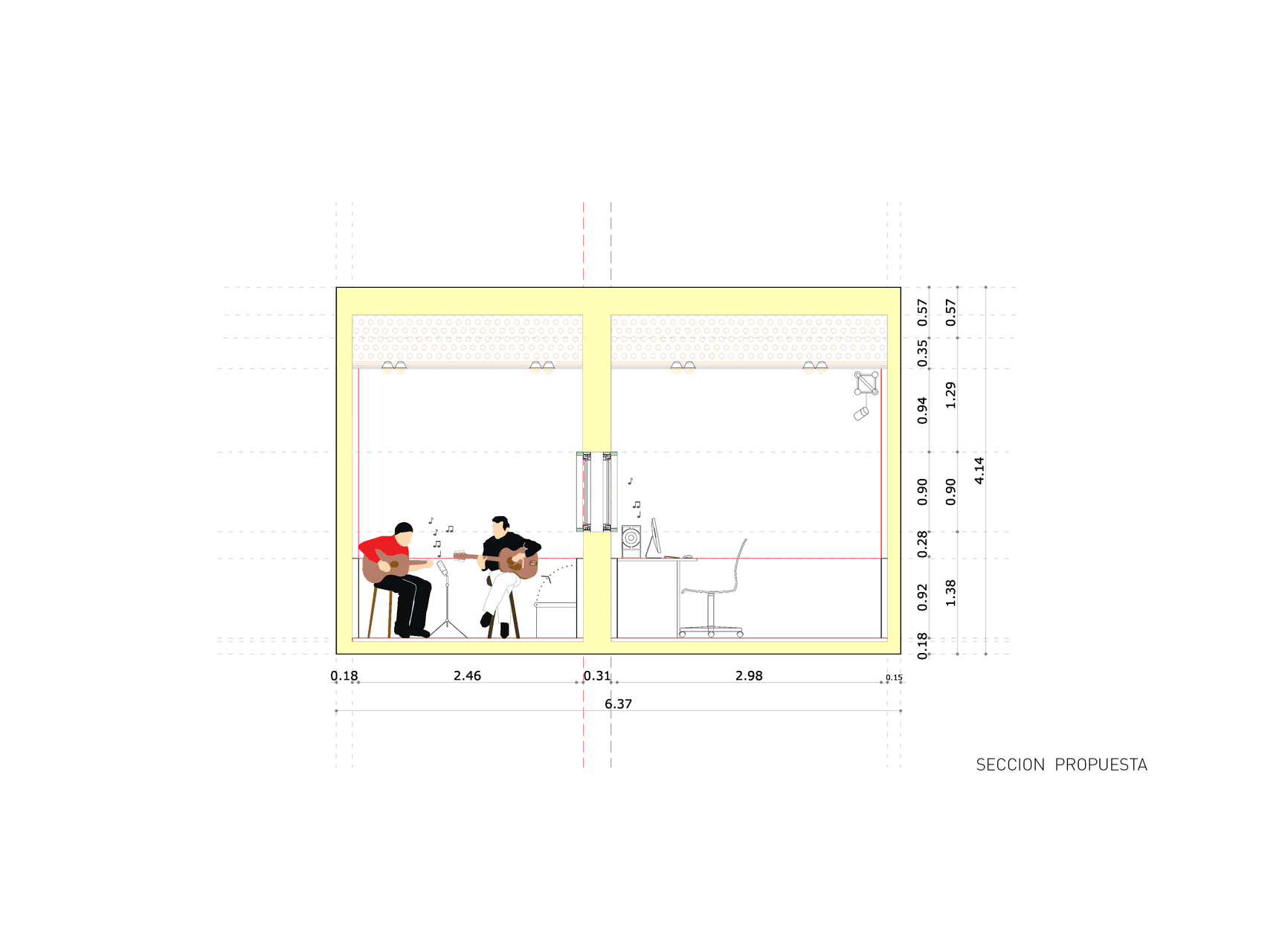
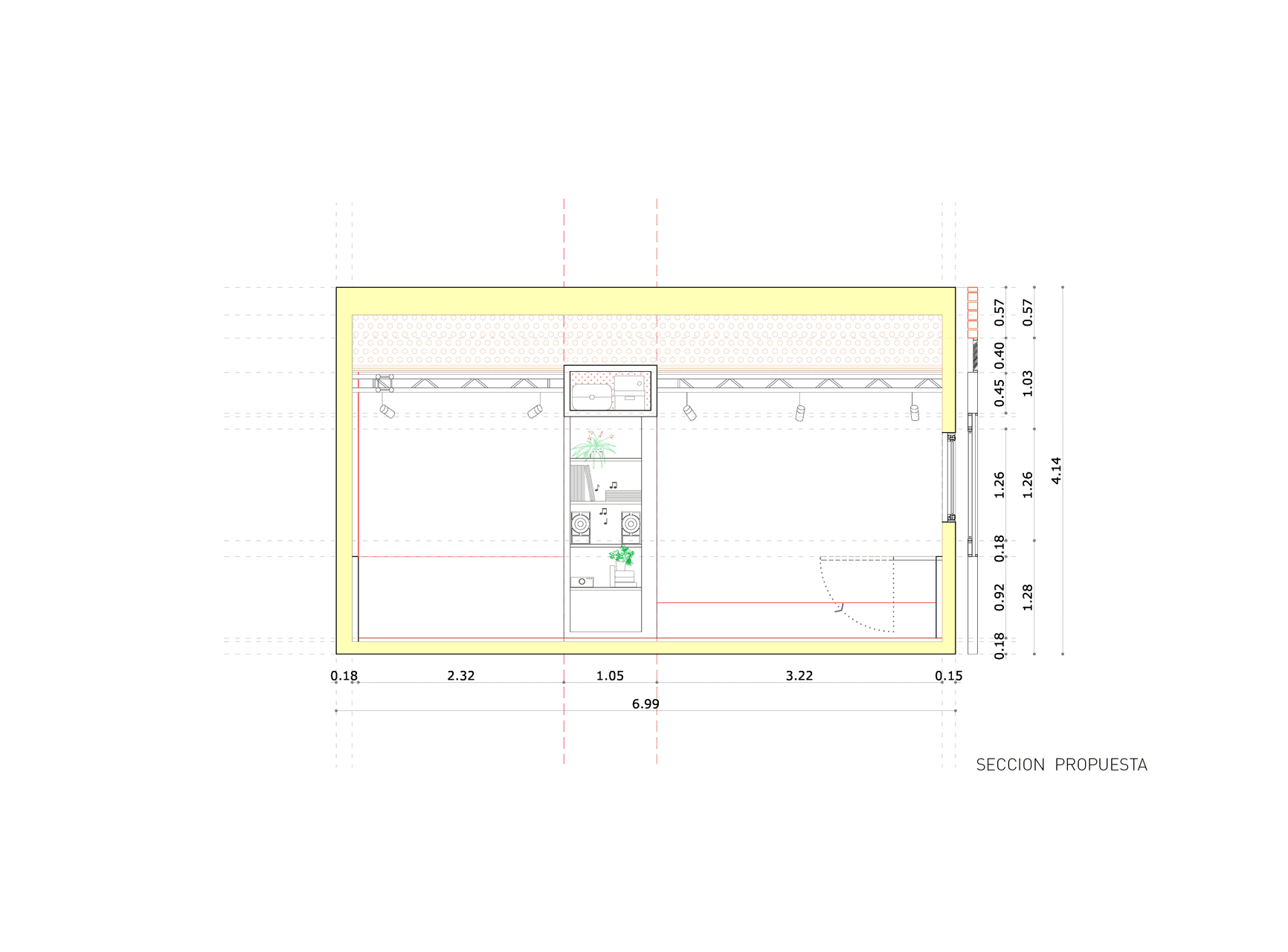
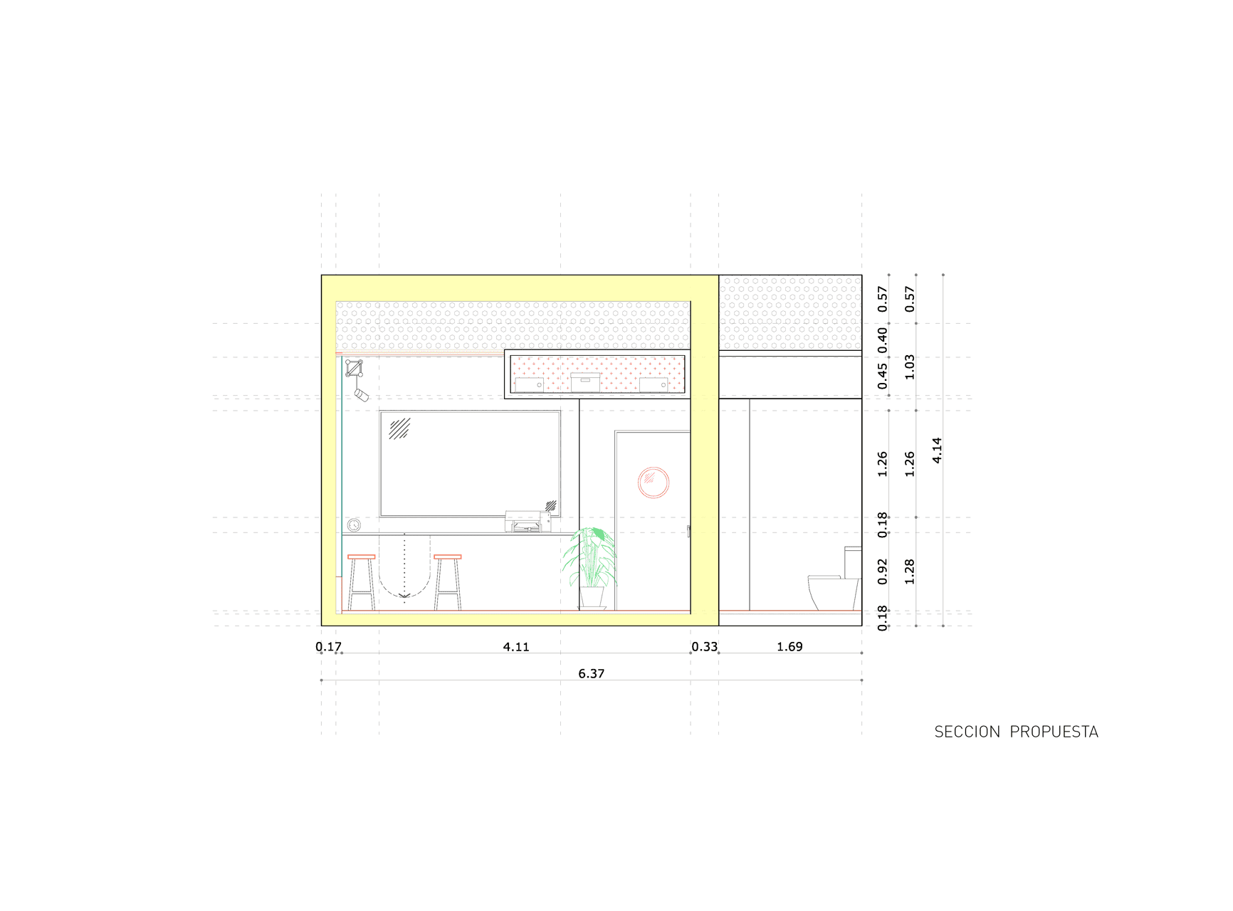
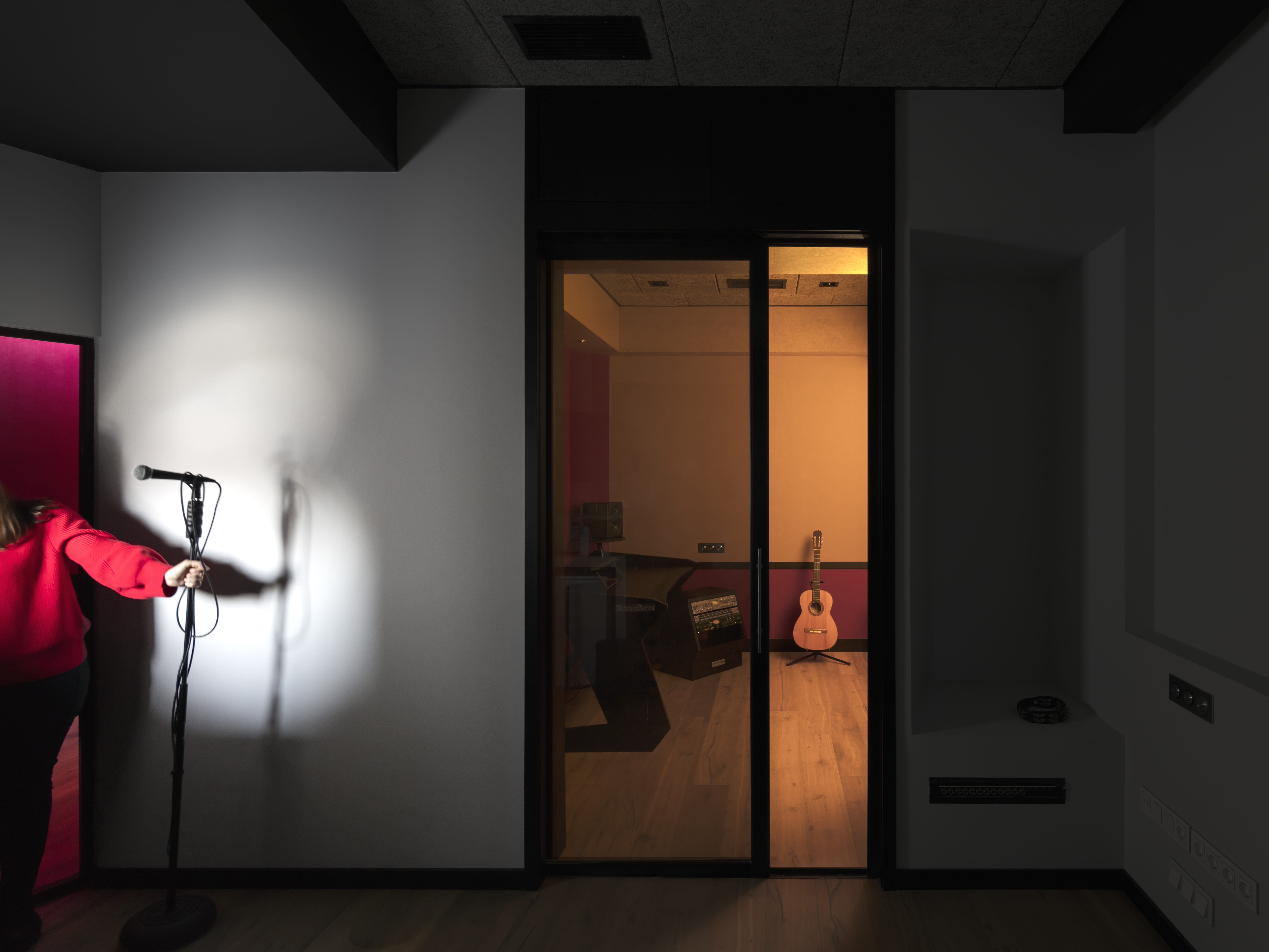
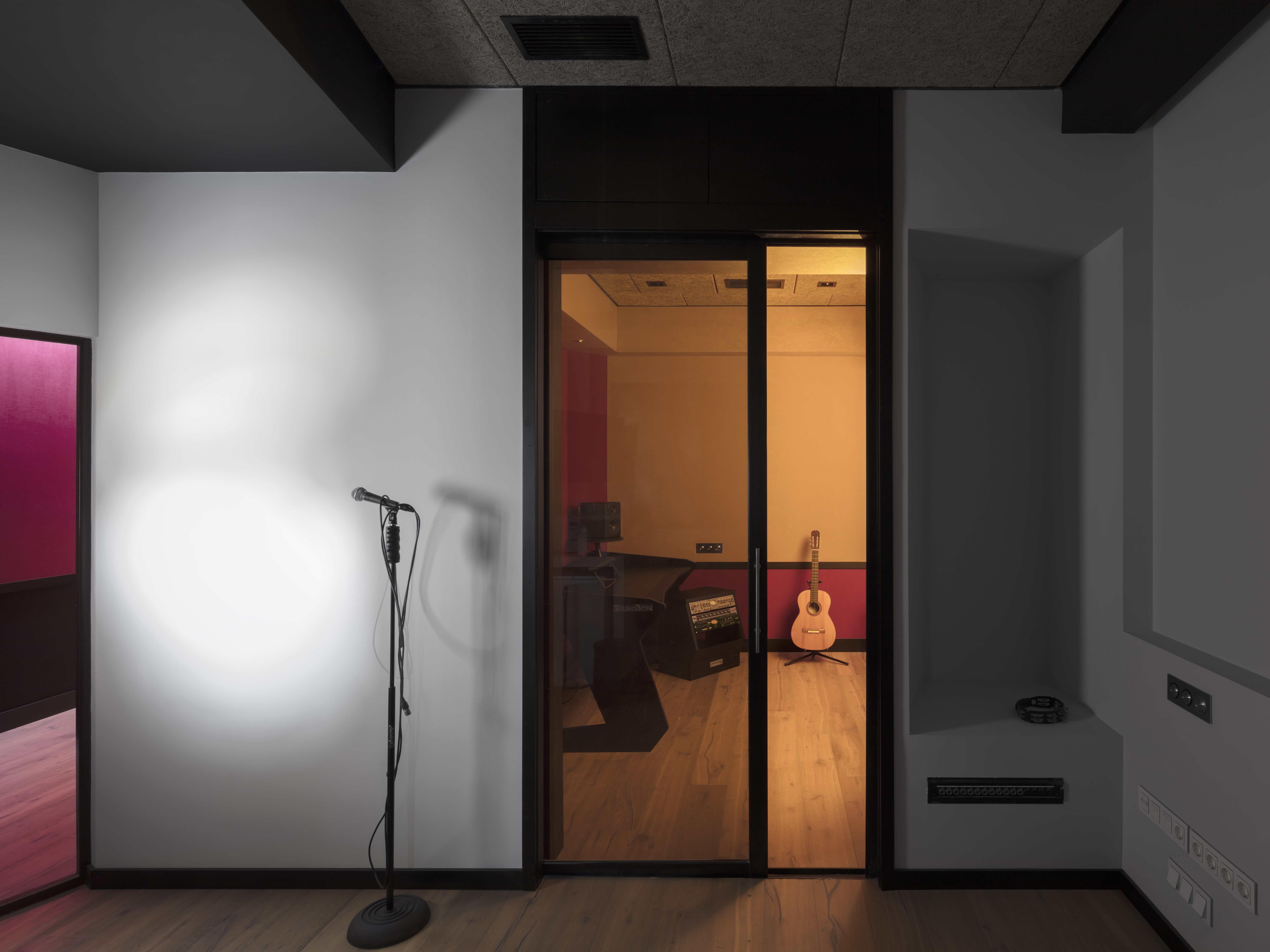
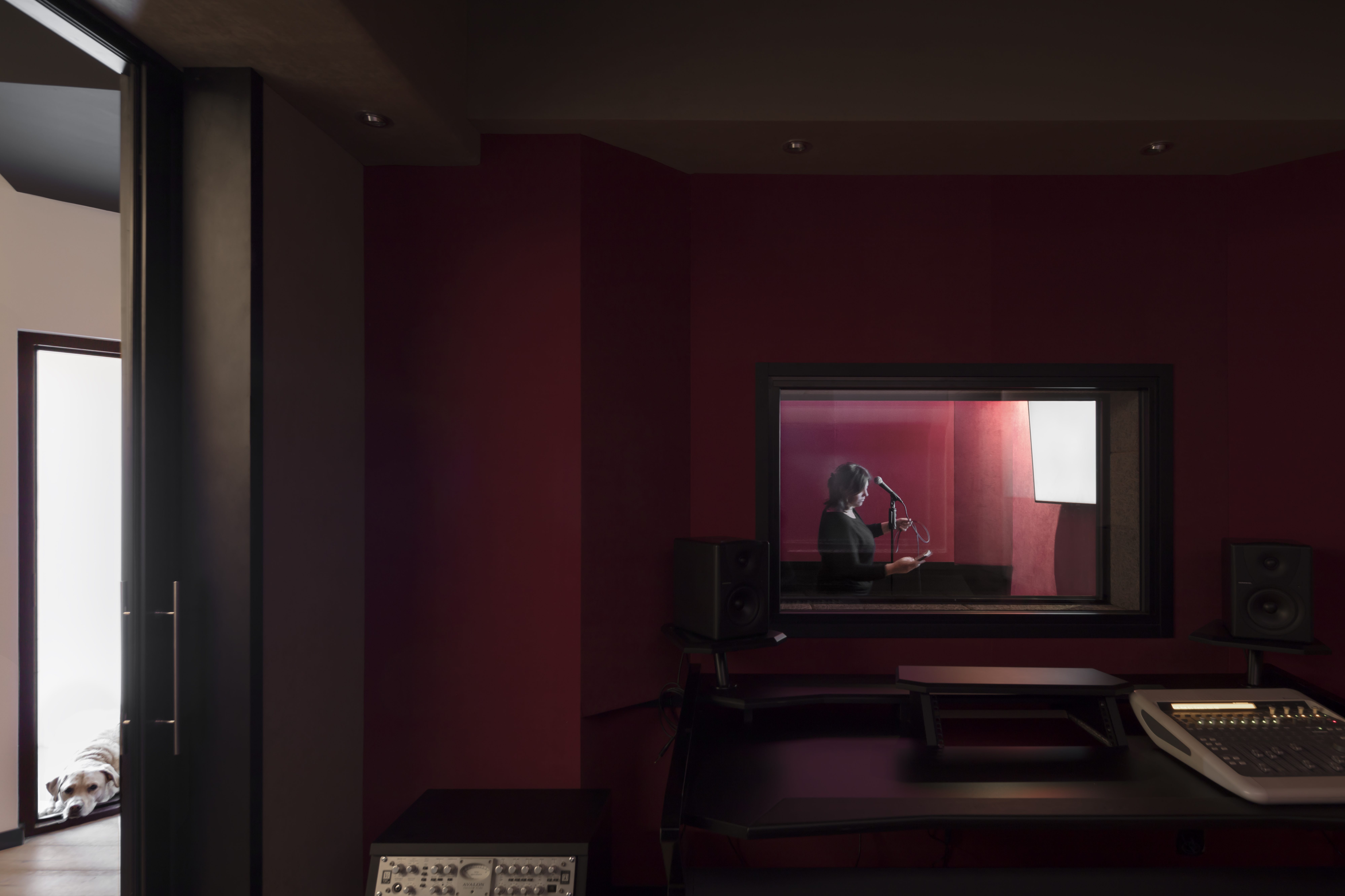
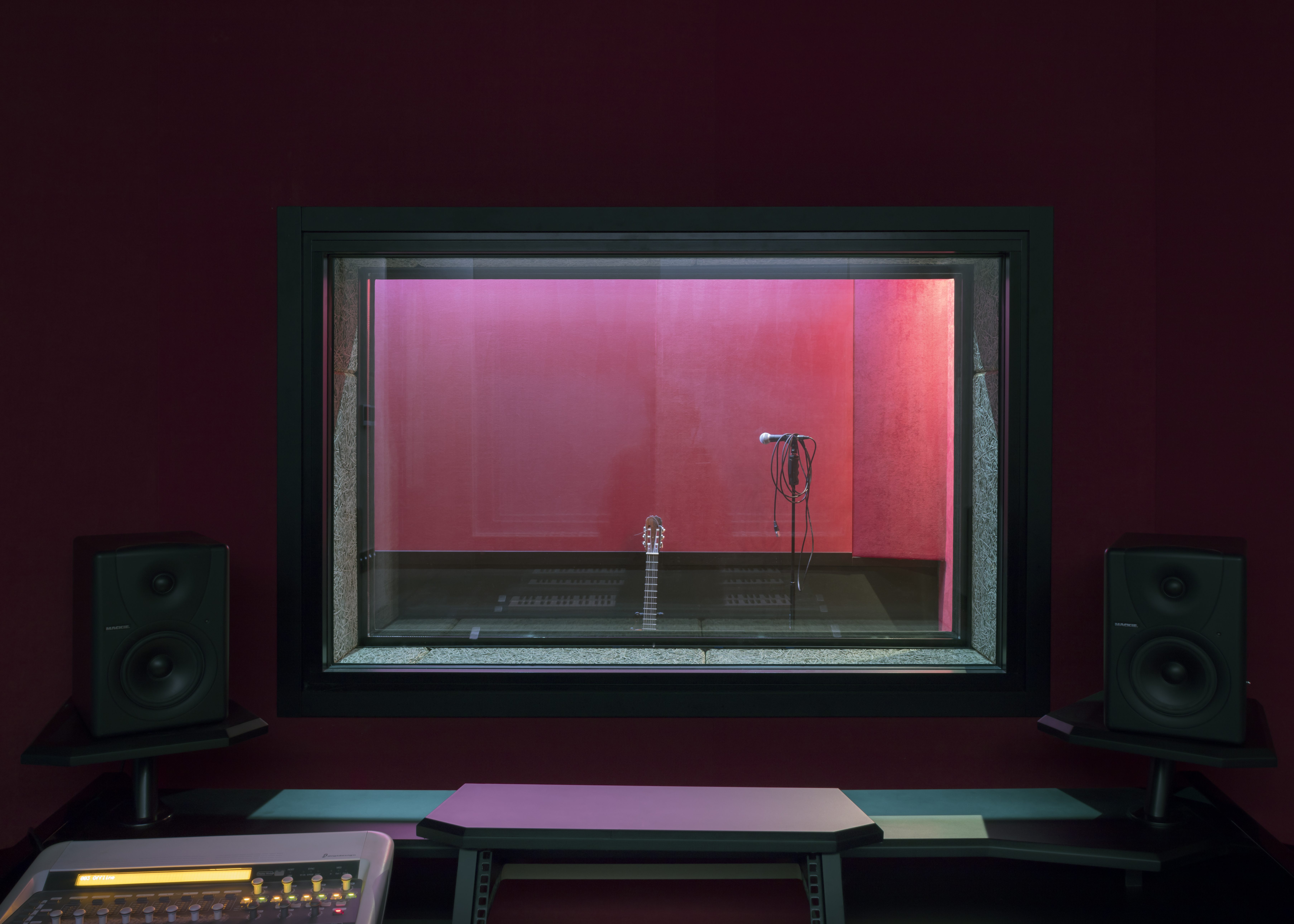
5, 4, 3, 2, 1… Access, bathroom, multipurpose room, production and post-production. These were the five spaces that Aneta, our client and user of Aneta Sound, wanted for her new sound studio. They should be five different and separated spaces but, at the same time, they had to be physically, acoustically and visually interconnected. It was a challenge for us, both the program and the constructive solution. There was no kitchen, no living room, laundry, bedrooms…nothing that made us think of a domestic program.
It was therefore necessary to give answer to new programmatic demands and, above all, technical demands. Because of this, it was necessary the assistance of an engineer to verify that we wouldn’t exceed the decibels fixed by the regulations and to sit with Aneta to provide every room with the necessary square meters.
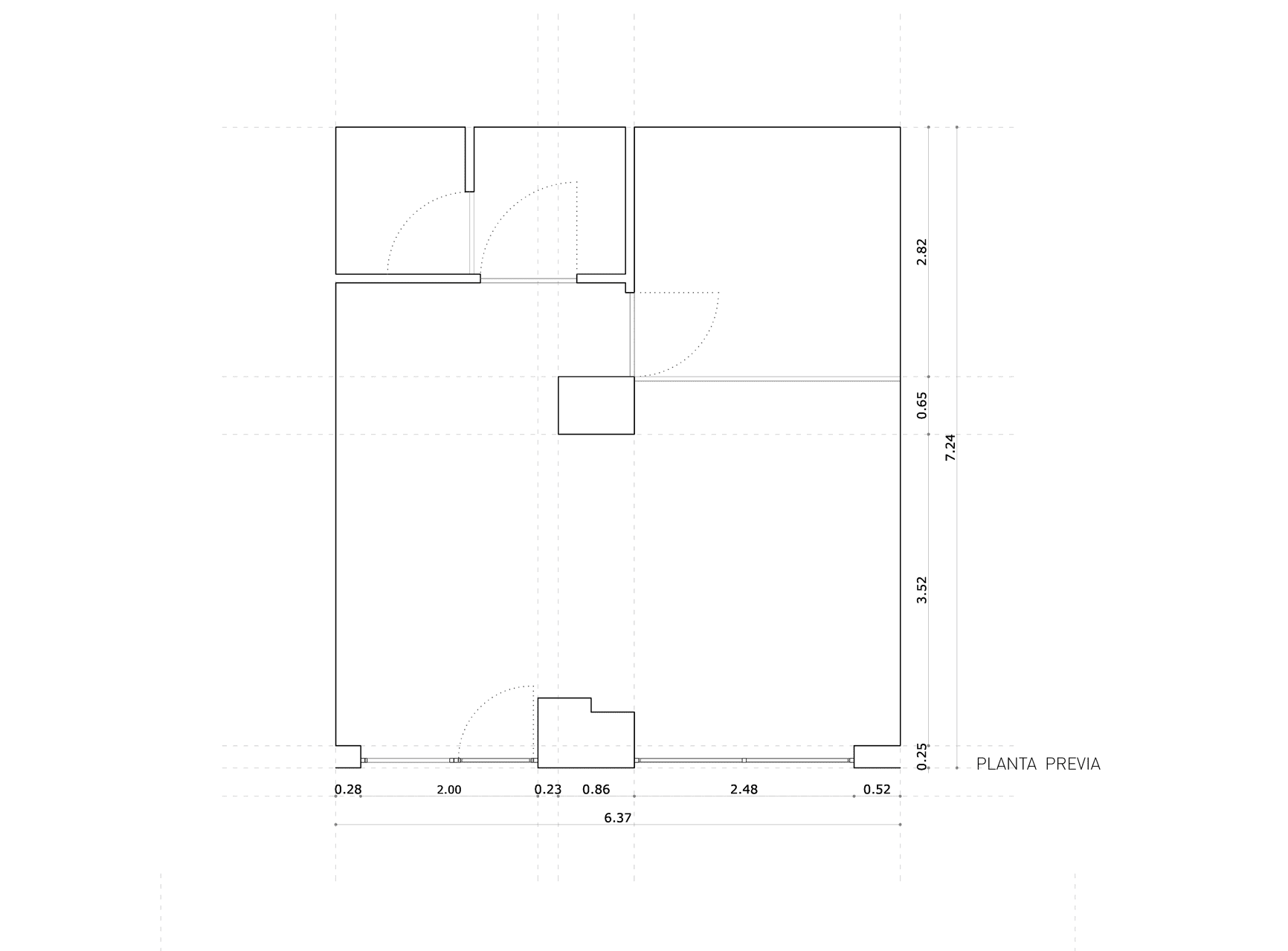
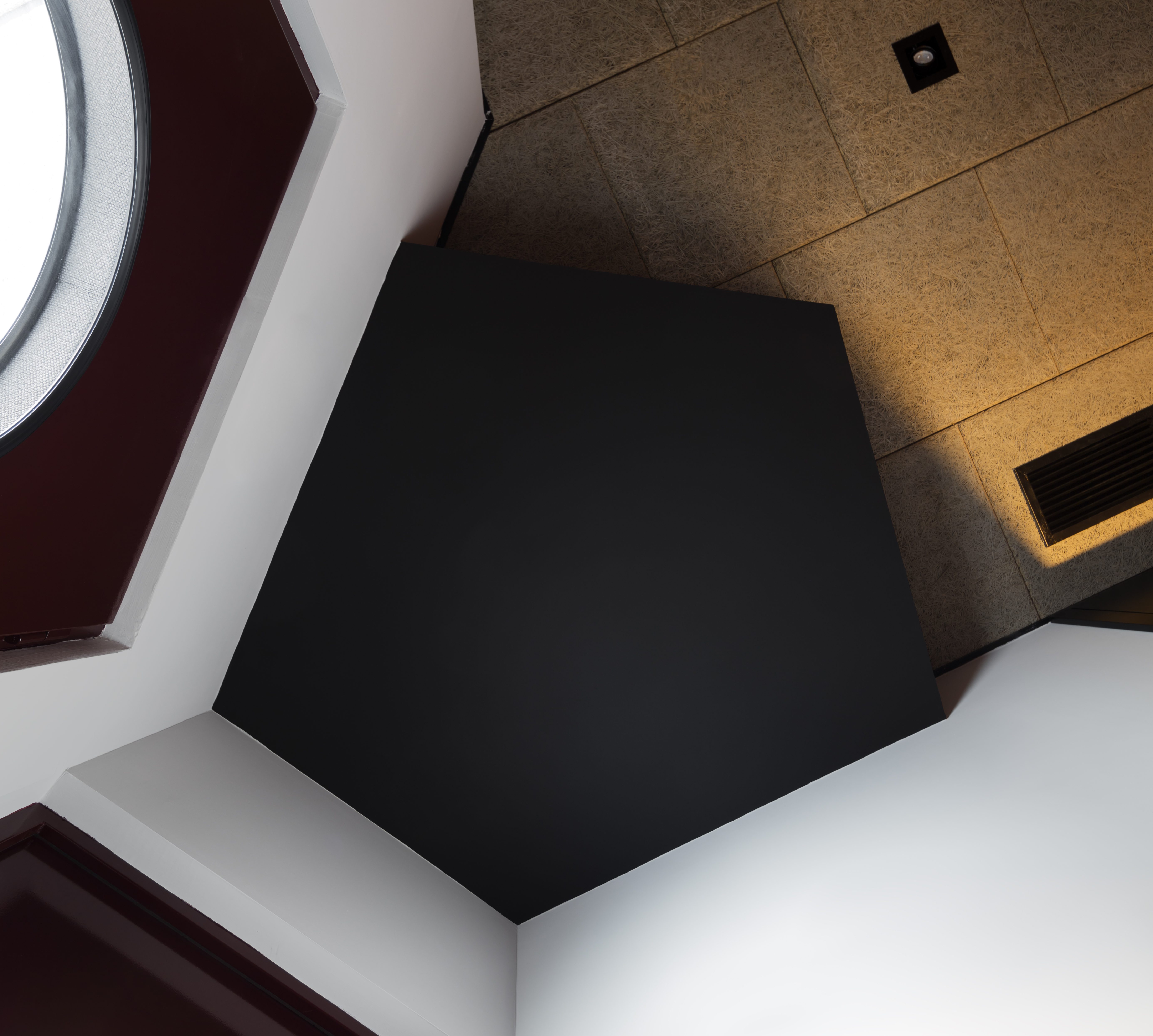
In order to fit all these premises, we needed to find a simple project strategy that would meet the following three conditions: it should subtly integrate a pillar in the central part, it should materialize with thick partitions (to meet the acoustic requirements) and it should allow to divide the plant in a balanced way into the five independent uses needed. And all this in a 45 square meters space, naturally illuminated only though a window.
As we always do in each of our projects, we searched for previous references that had to solve a complex program in a small space.
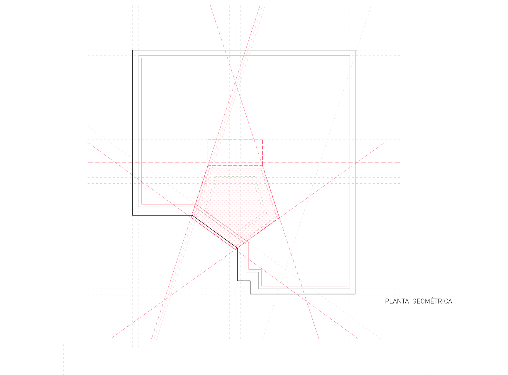
In this way, after several attempts to fit the program, our latest sketches suggested a geometric figure, which took us to a more or less regular piece around the central pillar. It could be noticed that the five necessary spaces of the program turned around this core. These lines, although they were only traces at first, would help us to organize and rank equitably the 45 square meters of plant.
What began as a scheme on paper, an imaginary piece, became a geometric diagram, that we would use as an instrument to solve the problem. What at first was an irregular polygon turned to a regular one: a pentagon.
In all our projects it is important to use geometric diagrams as a tool to solve the spaces. Up to that moment, however, they had been pre-architectonic instruments subtly diluted as the projects progressed. In this occasion, in a very special way, our design process starting from geometry was very disciplined, as it was totally connected to the polygon: from that moment on, every decision taken would be linked to it.
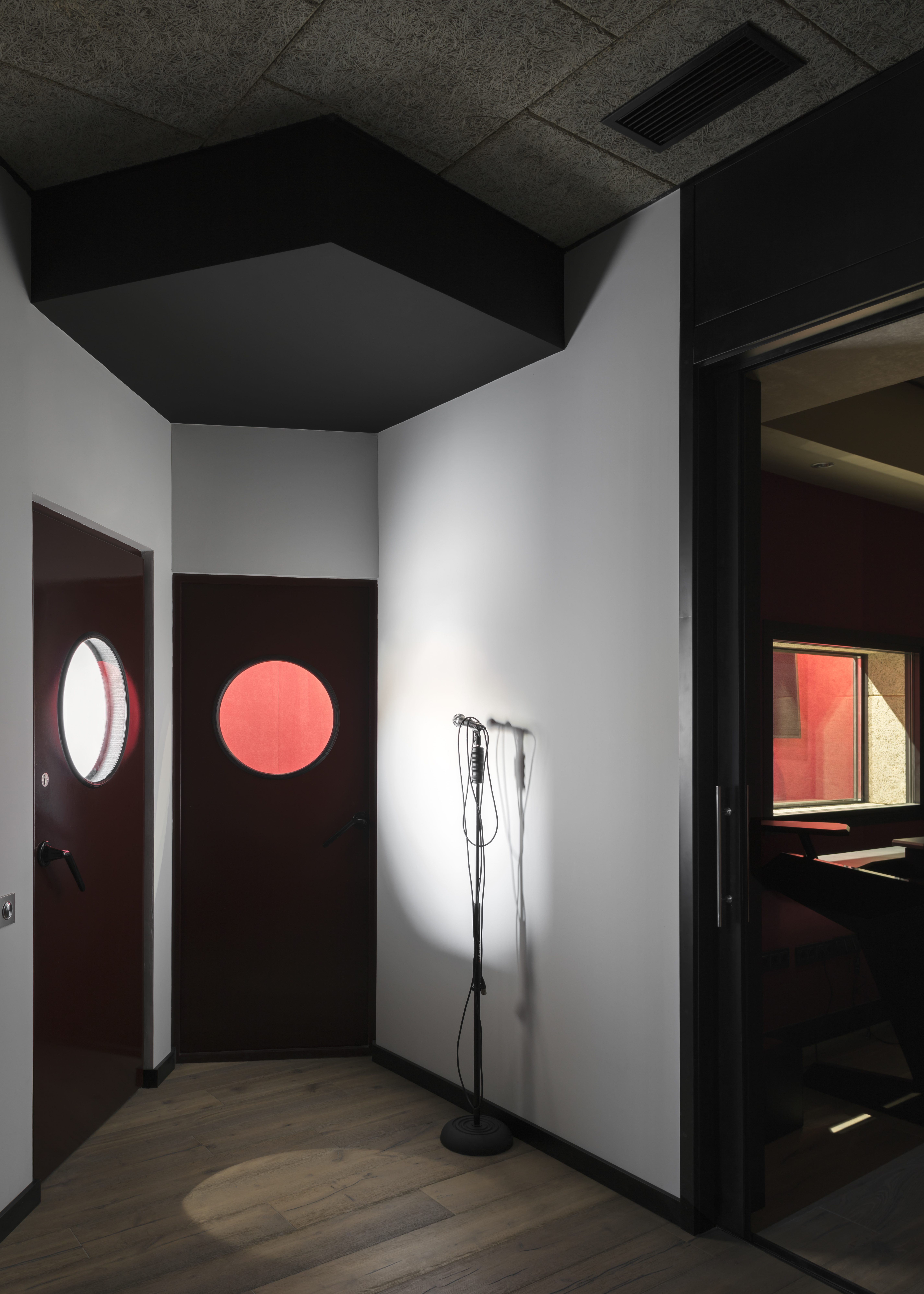
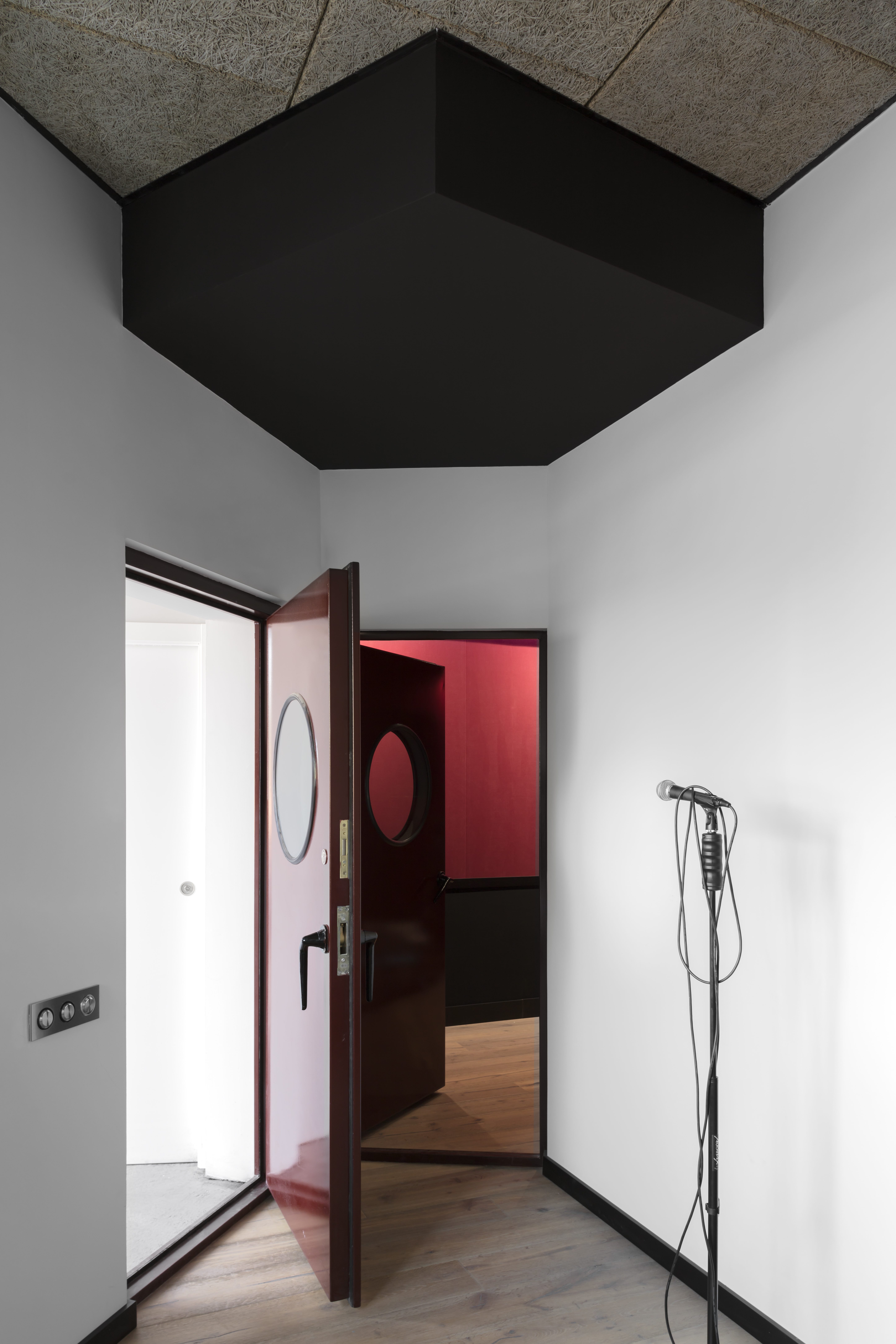
The pentagon became a privileged point, which visually controlled the spaces, allow their coexistence and enable circulations.
From this geometric figure emerged auxiliary lines with the ability to auto-arrange the space from an harmonic, tuned, balanced and elegant rhythm. From these traces it was possible to give an answer to the full and the empty, the lights and shadows, the high and low elements, to what was storage and empty, to what was room or passage.
Aneta at first tried in several occasions to pervert the shape of the pentagon. She thought that we would gain space by extending one of its sides, and that we would have more intimacy in one of the rooms by modifying the figure…however, due to the subtlety of the piece once executed, she finally admitted that the Pentagon was the best solution.
In the second stage, but not less important, we went deep into the materiality of the rooms. Due to the technical requirements of a sound study, both the hidden and the visible materiality were extremely important. The choice shouldn’t be left to chance or unjustified impulses.
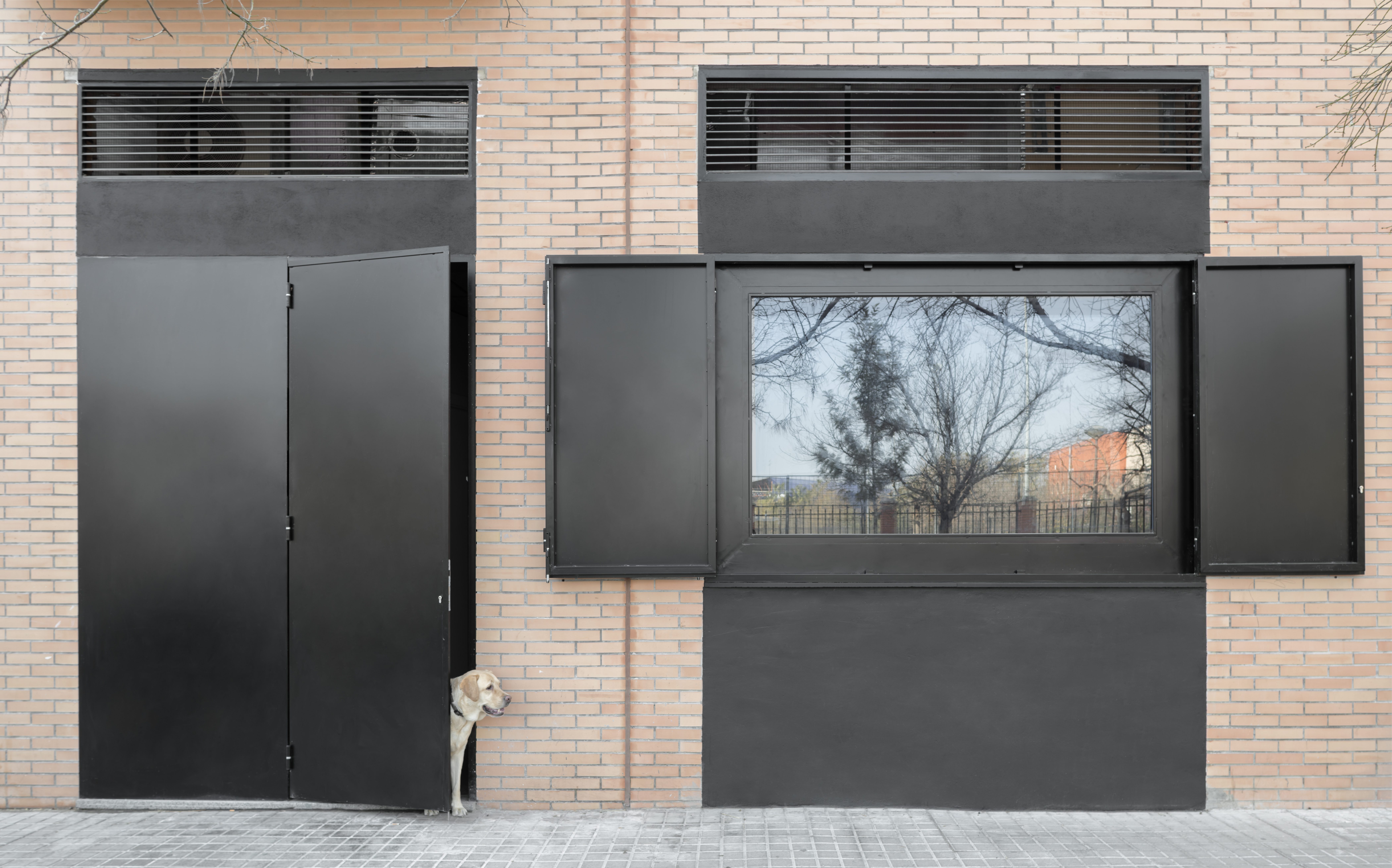
In the apparent materiality, however, Aneta would leave her imprint very clearly. Through the harmony of the different textures and colours, which were not going to be discrete at all, all the spaced would reflect her personality: the warmth of the acoustic fabrics in varying red tones, the cozy texture of the wood on the pavement combined with the sobriety of the white walls and the coldness of the black carpentry.

