
La serpiente del Botànic
Realized together with Valeria Zamora
Adrián Ripoll. Estudiant d'arquitectura
Milena Villalba. Fotògrafa
One of the housing typologies that we most frequently come across in València for renovation is that of the mid-20th century extensions: elongated pieces between the street and the interior of a large block, with narrow façades and small courtyards attached to the sides. These dwellings generally invite major changes with small improvements.
In this case the aim was to renovate an inheritance that had modified the original dwelling by lowering its ceilings and concealing the floors, which made it somewhat dark and labyrinthine. However, the final result should not stray too far from its origin in order to preserve the memory of the house in which the grandparents had lived and of which many of the furnishings were to be kept.
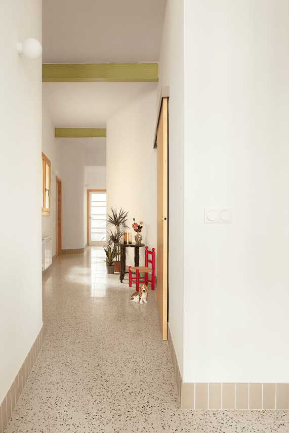
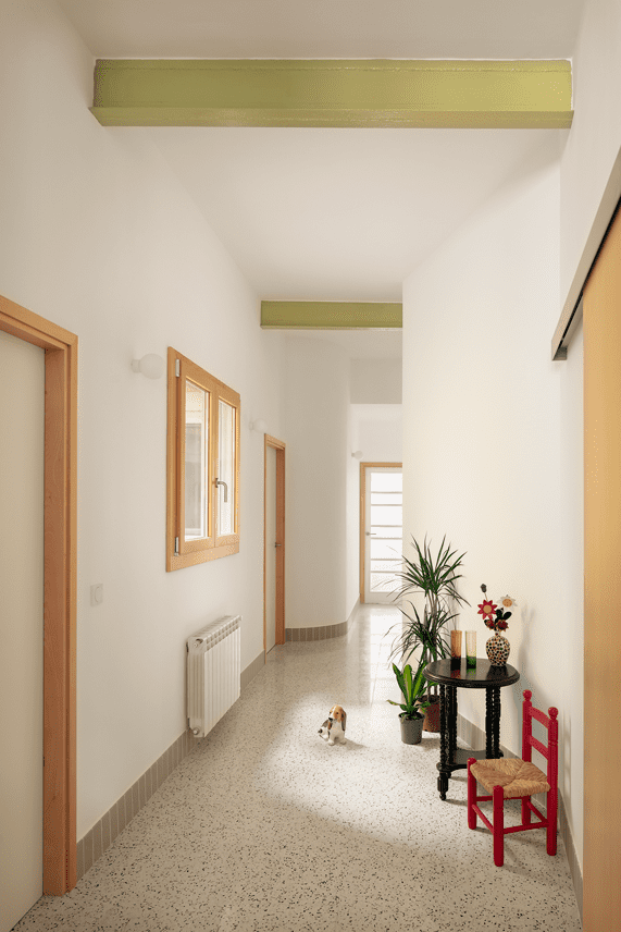
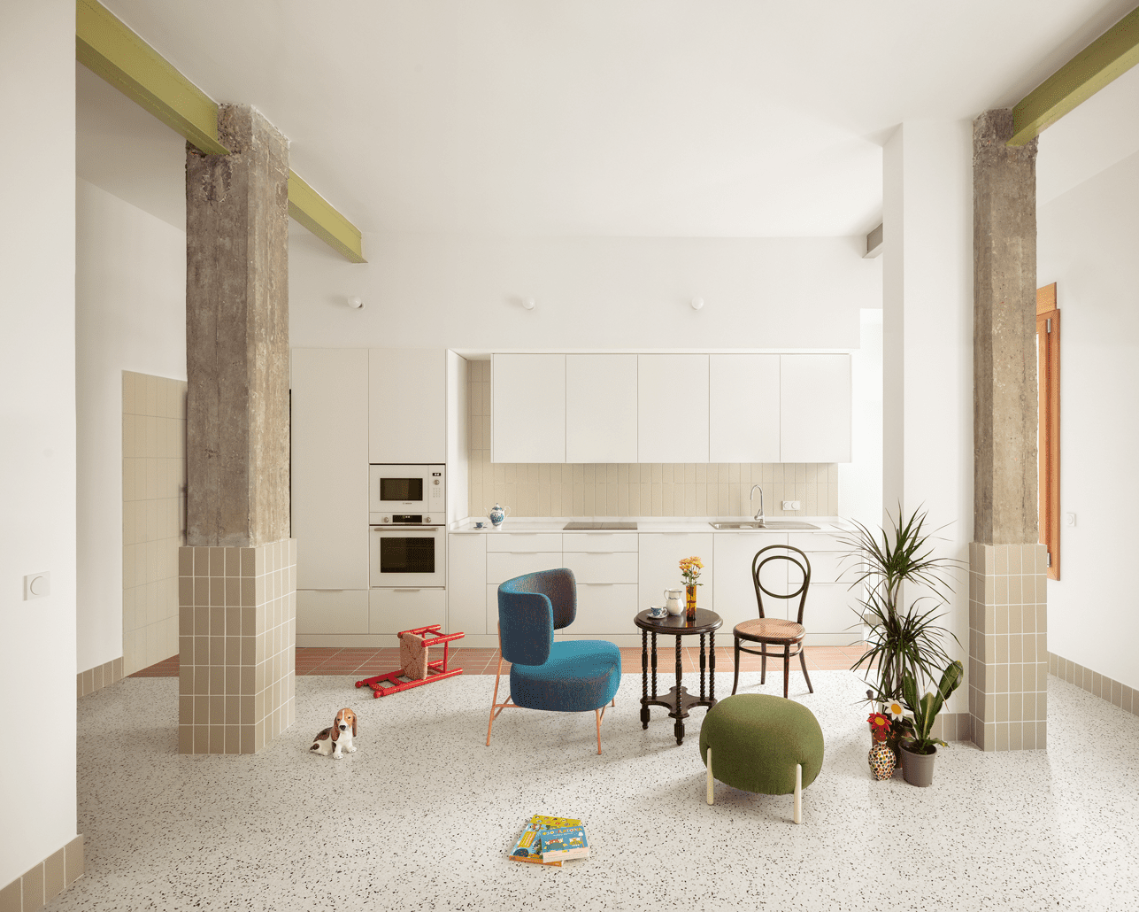
We carried out a partial demolition, maintaining the current bedrooms, which had good dimensions and location within the house, and redistributed the bathrooms, kitchen and living-dining room, thus allowing the corridor to cease to be a narrow, dark room and become another part of the house instead of a mere passageway.
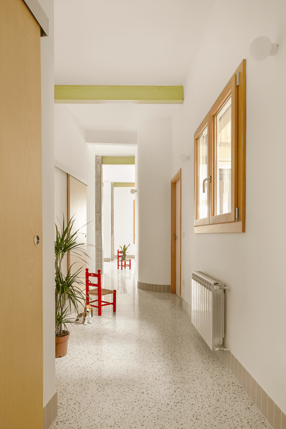
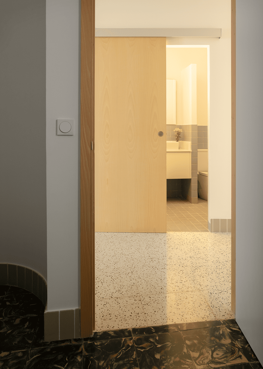
The bathroom now forms a sinuous curve that allows the views to be directed towards the inner courtyard, where the Botànic is located, from the entrance. With this small action we achieved a great change: the sensation of spatiality in the house is increased by being able to accommodate life and furniture thanks to its widening and the lighting of the central space is improved by allowing natural light to enter from the courtyard.
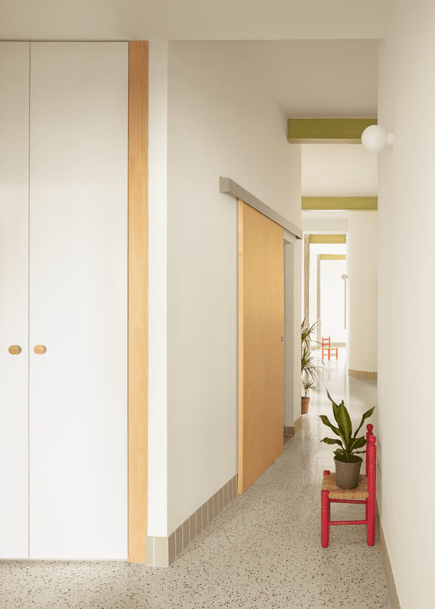
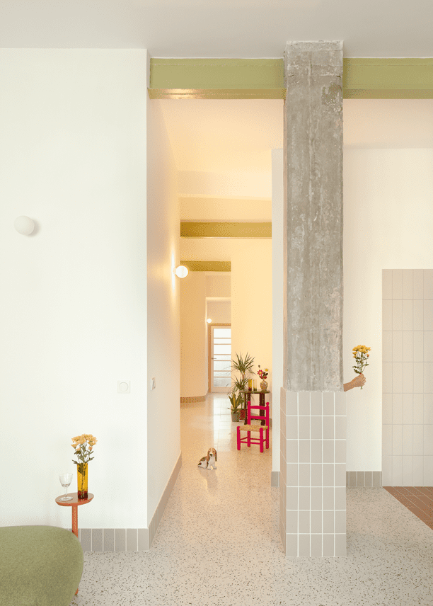
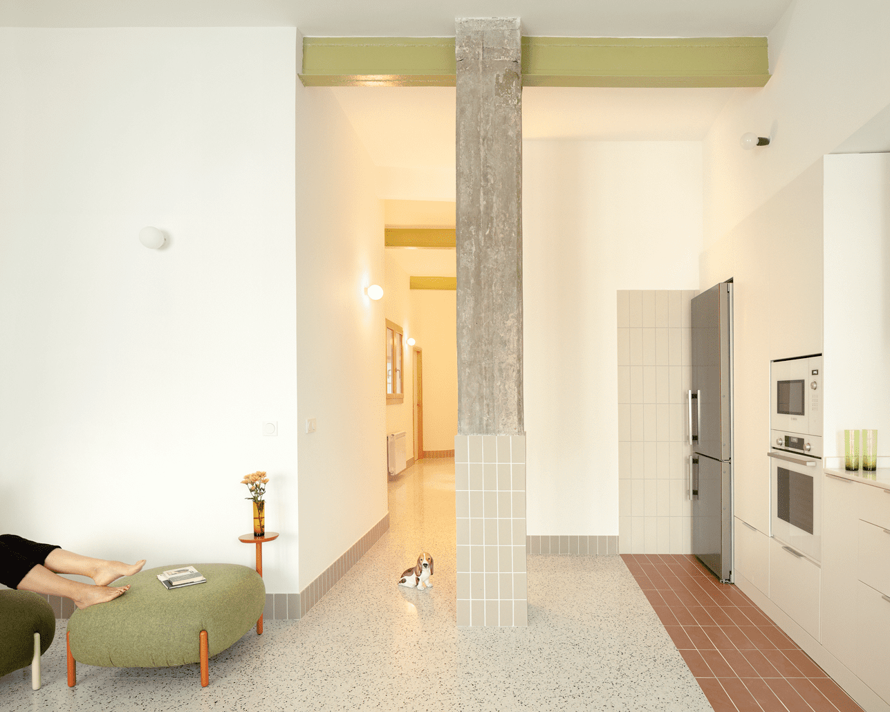
Spatiality is also achieved by eliminating the superfluous false ceilings and leaving the original free height and removing the false ceilings that concealed the metal beams. In this way, the corridor, which is now just another room in the house, has a great free height, emphasised by the beams that appear in the perpendicular direction.
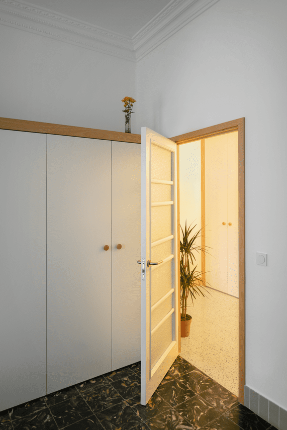
This idea of pursuing the elementary was also followed with the materials. What worked well in the house was retained: in the bedrooms we recovered the cement tiles that had been hidden under a vinyl floor or worn out by the passage of time, while in the rest of the spaces of the house we replaced the floor tiles: in the route that begins at the entrance and ends in front of the rear façade, we used a new very fine-grained terrazzo floor in grey, white and black tones that simulates a continuous carpet, which combined well with the cementitious flooring in the bedrooms with a black background, white water and small brownish splashes. For the rest of the house: details in the kitchen, flooring and tiling in the bathrooms, skirting boards and cladding on the pillars between the living room and kitchen, we used a small ceramic piece – different depending on its location – in greyish, greenish and earthy tones that provided neutrality and sobriety without being boring.
The serene warmth is provided by the beech wood used in the external joinery, the interior doors and the details in the handles and the cupboard trims that are distributed throughout the rooms.
The colour appears in a very subtle way in the refurbished and recovered beams that, emerging above the white tapestry of the ceiling and walls, help to mark a rhythm and emphasise the sequence of the spaces.
The result is a project of concise ideas which, together with the use of few good, discreet and well-placed materials, allow a harmonious combination of what is new and what remains.

