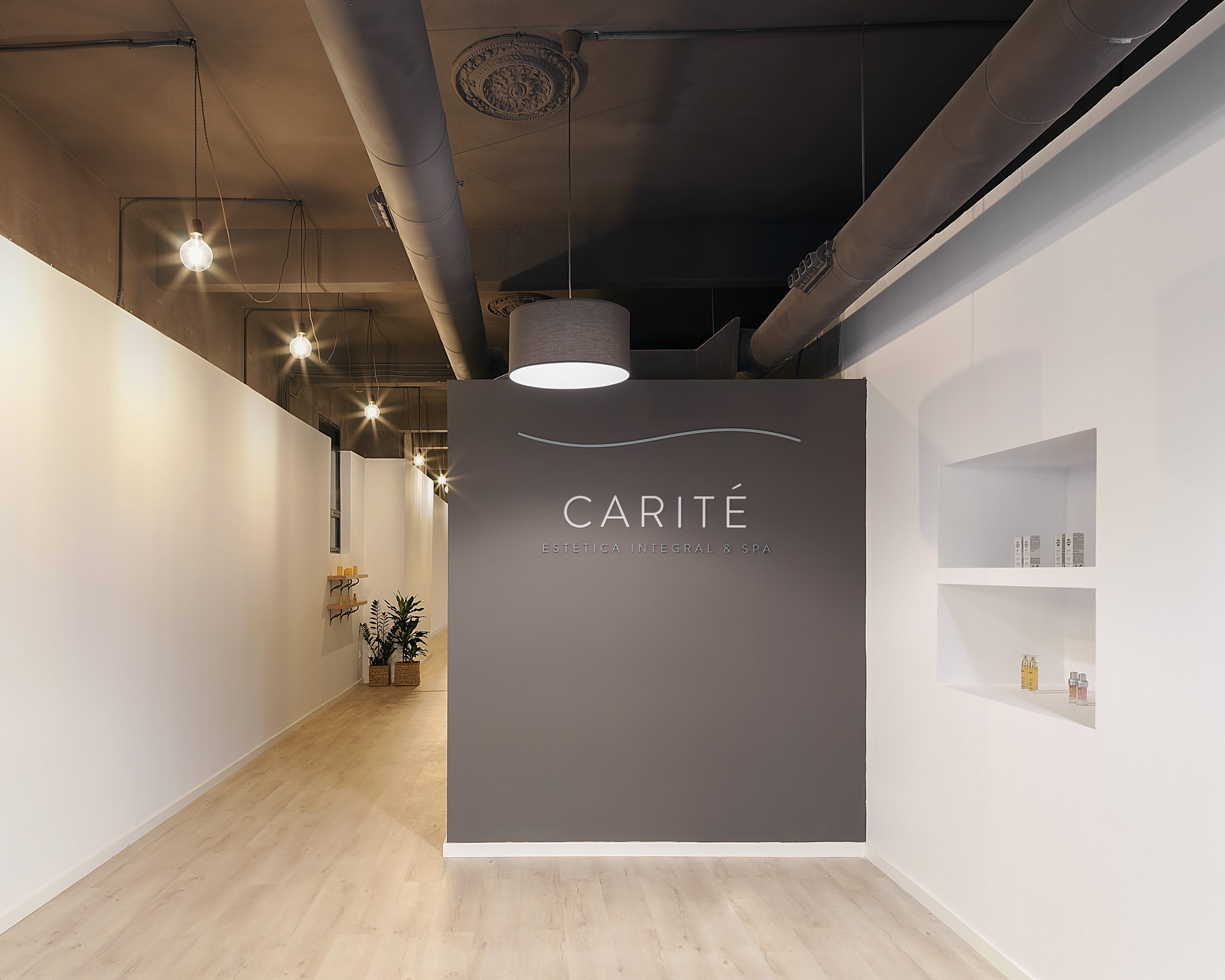
Carité is a well-being place to pamper yourself. Peaceful, refined and harmonized, it aims to be the hideout where the user concentrates on its own balance and wellness. Carité Clinic can be both distant and cozy at the same time, a cold lounge where the protagonists will be the products and the clients, the responsible to give color and warmth that every beauty salon demands.
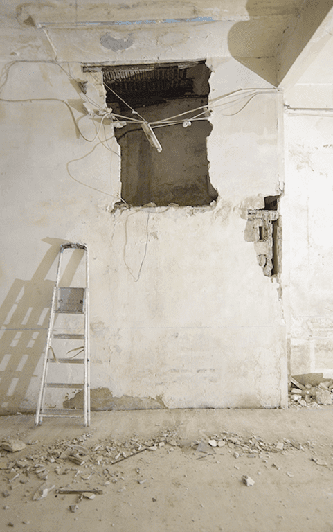
The area we start is emotionless and dark. The apparent order breaks down while the plot gets its end. However, the salon is height and deep.
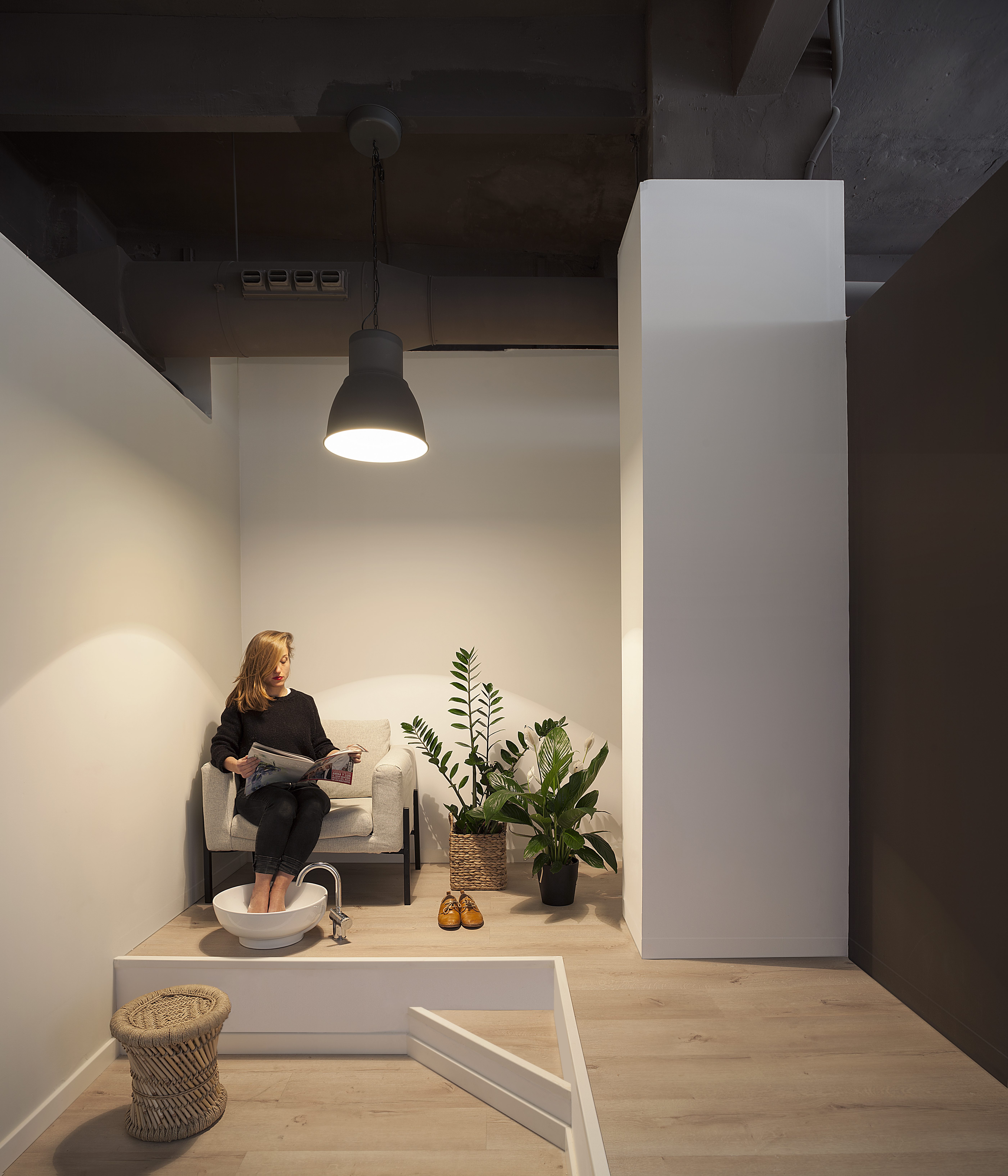
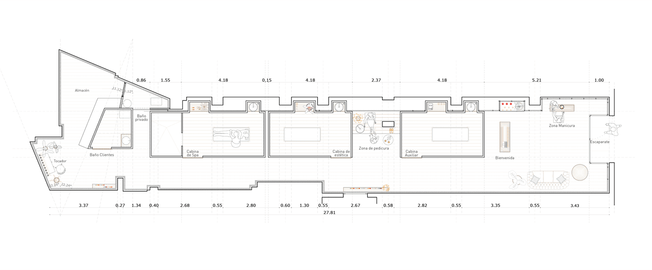
The program that Beatriz and Jessica had planned for Carité was very clear: they needed three private and closed areas dedicated to SPA and aesthetics, an office, a store and a bathroom, as well as different areas in which carry out manicures, pedicures and makeup sessions.
The project is based in four ideas:
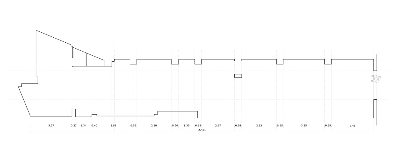
A more flexible geometry
The need to get as much natural lighting as possible
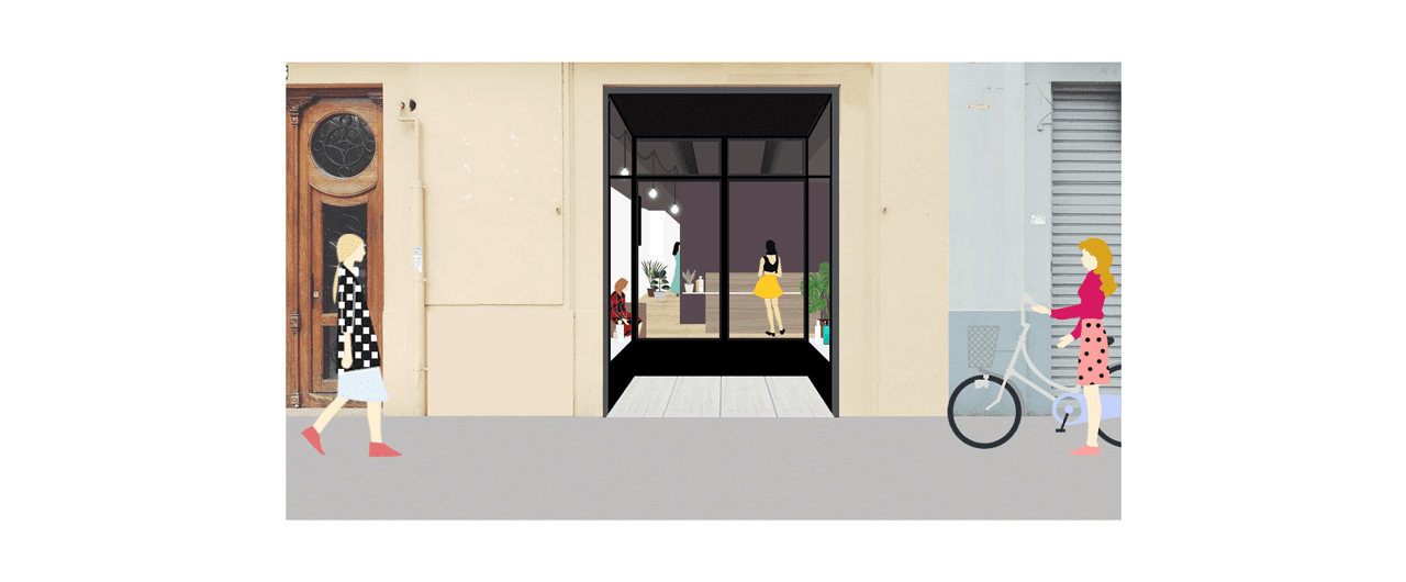
An entrance hall that wants to be a lounge
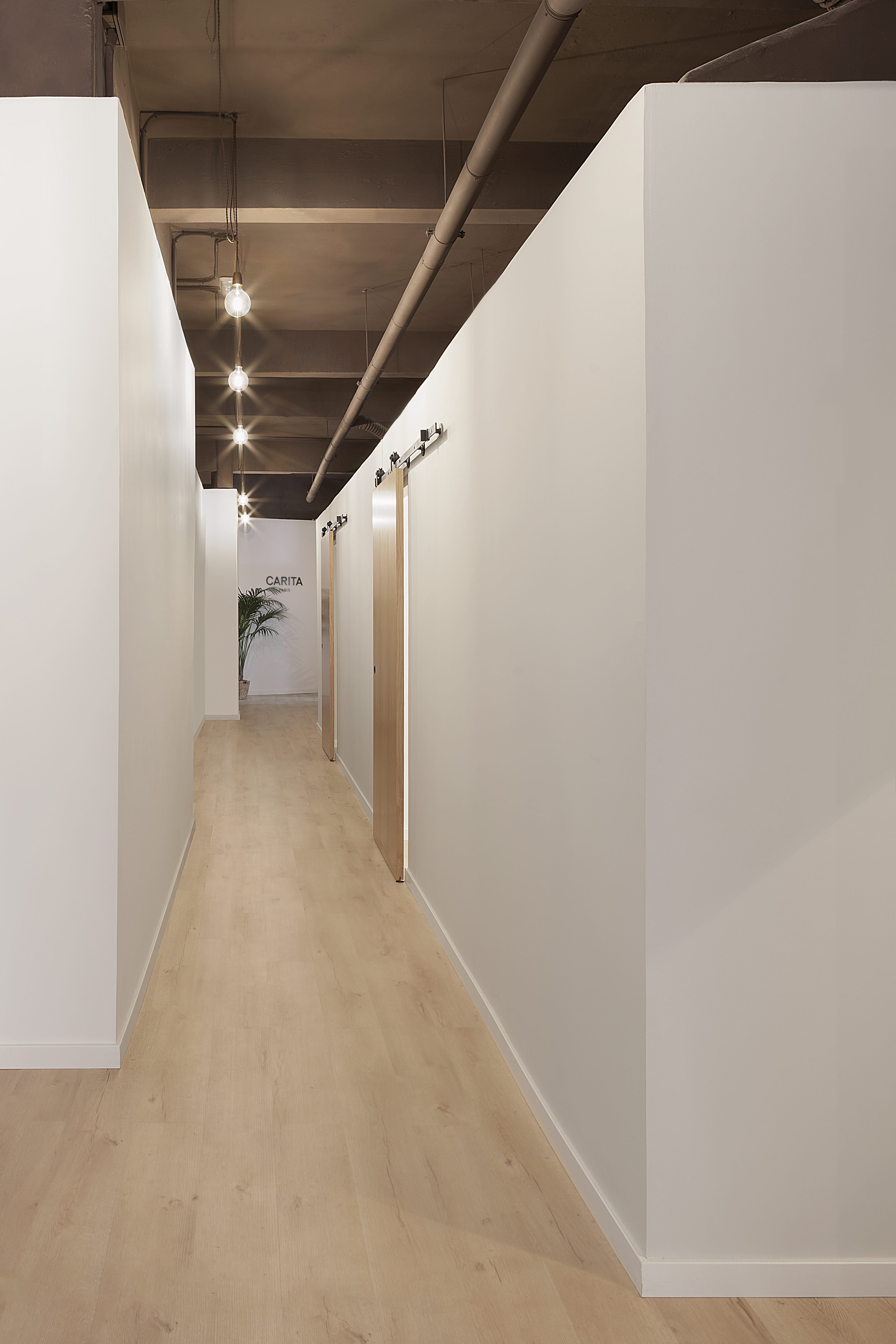
A hallway that wants to be a window display
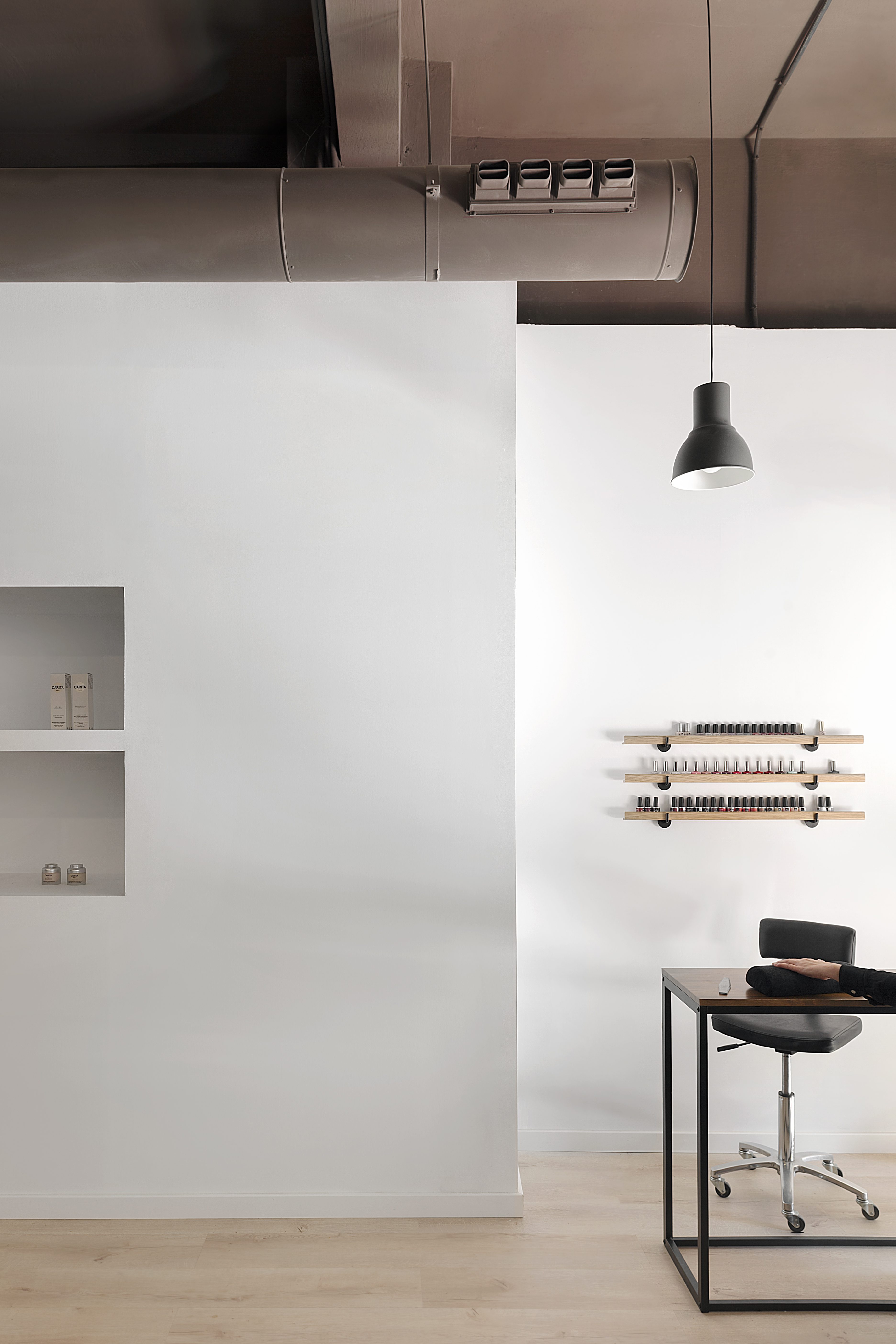
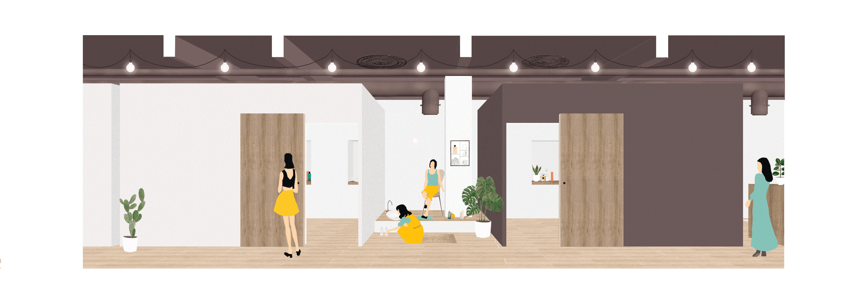
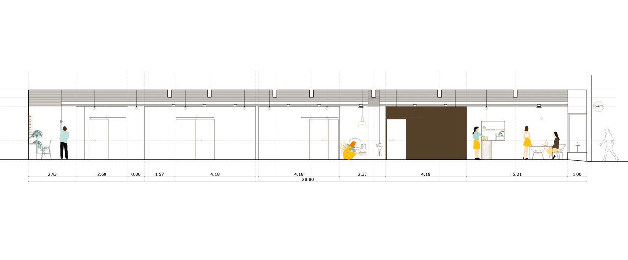
We set up the program along the narrow lot as a concatenation of open and close spaces which formalize a path: the products exhibited at window display invites to go inside as well as the manicure is going on the interior of the local. Once inside, a desk welcomes the clients.
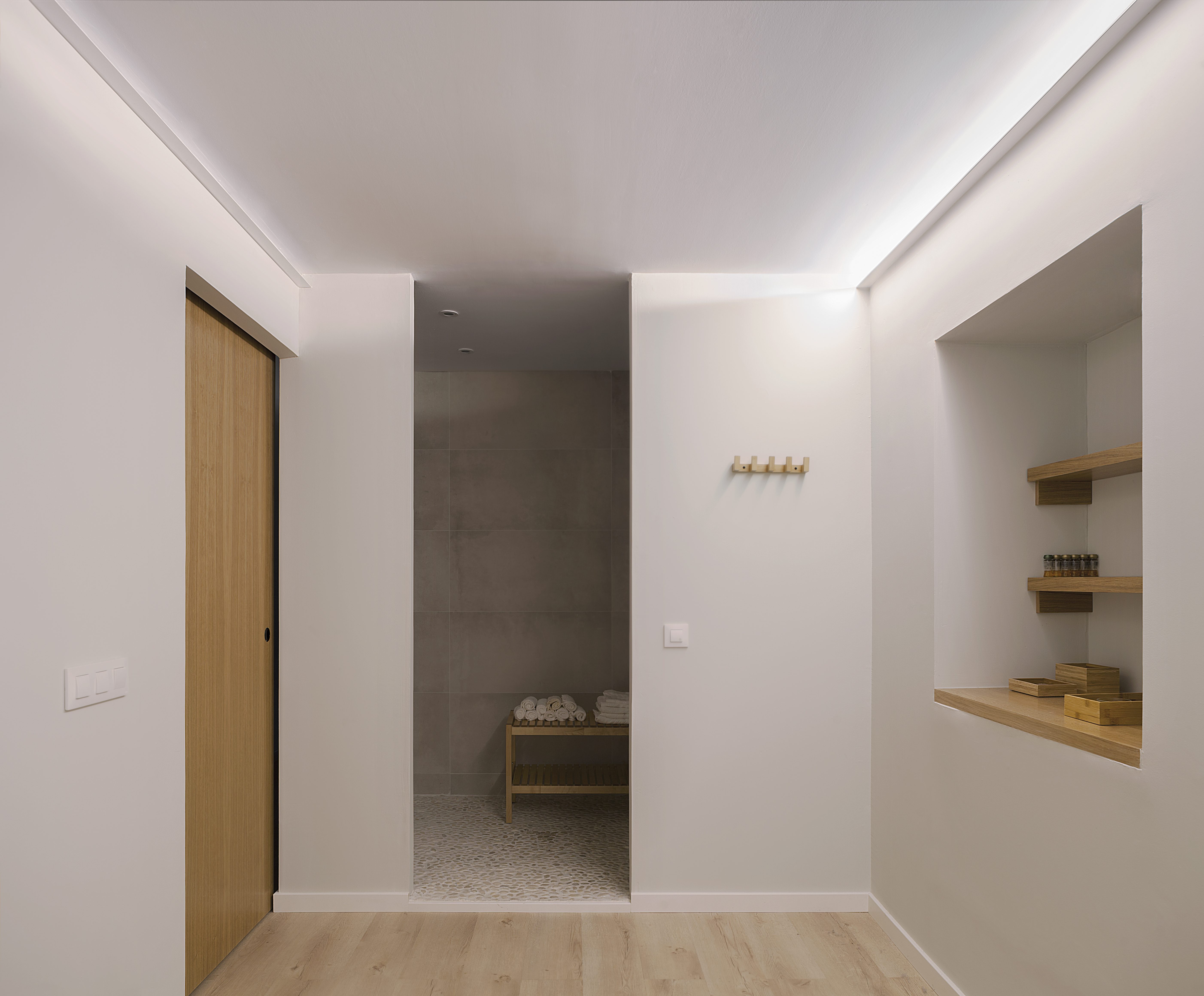
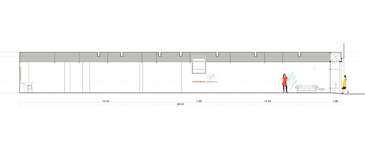
From here the boxes are perceived as closed rooms that don´t reach the ceiling, which helps to read them as independent boxes. From their interior, they are felt as private spaces for retreat. Open areas are destined for activities less intimate.
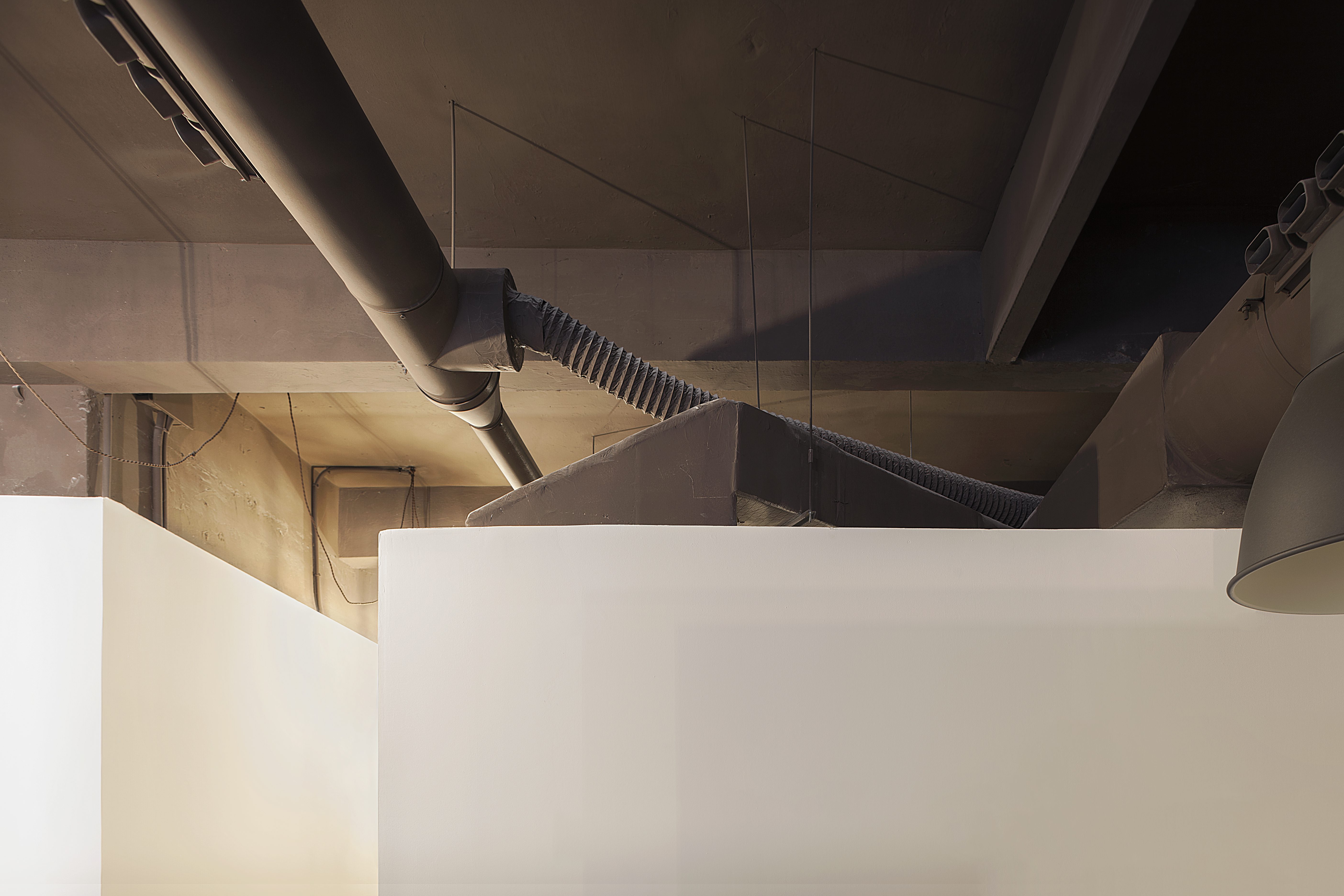
We leave aside the idea of high partitions or ceilings that fragment excessively in order to get the sensation of a continuous and fluid space in which natural light flows through the main door and filters discreetly in all its length. Building insulated cabins without the ceiling allows that all the mechanical equipment run through the roof and go into the cubicle when necessary, resulting in a dry construction executed project at a high percentage. This decision is taken to speed the construction, but also for aesthetic purposes: clarity and cleanliness.
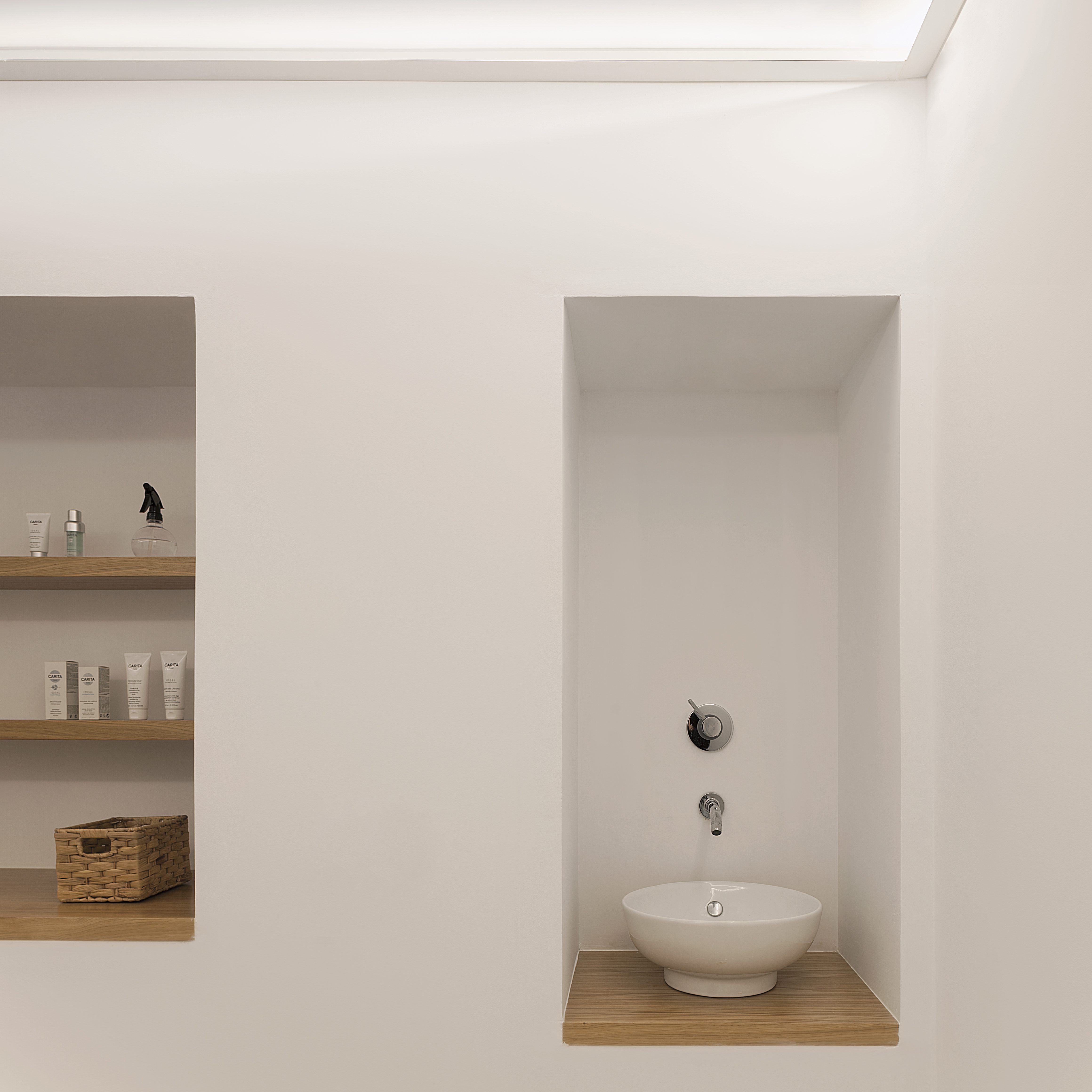
The continuous rhythm of open and close spaces is transferred even to the interior of the cabin, making holes in them as niches that house a sink and a small window. After the first box the corridor widens and the area for manicure is projected in an open but more discreet way.
And it is at the end of the premises when there is an unexpected geometric chaos where we place a last box that hosts the customer’s bathroom. This area will assume a series of turns and inclinations with two objectives, on the one hand to balance the planes variations in the dividing walls of the premises, and on the other hand to locate the storage area and bathroom area for the employee. This approach allows to get the idea of having a continuous space from the beginning to the end as non-fragmented space.
Published on veredes / arqa / divisare
