

El octógono de Pelayo
Paula Cerverón. Architect
Milena Villalba. Photographer
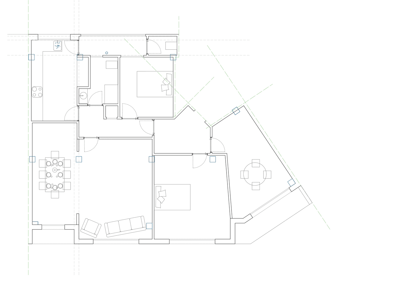
We found a house that, in appearance, was not interesting in its distribution or its materials by itself. From the access, through a dark corridor running through the entire house, there were rooms in both sides.
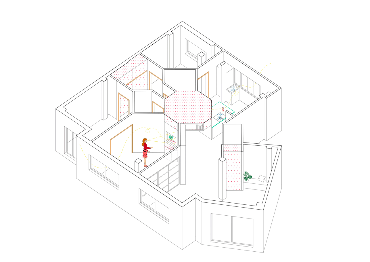
However, once the demolition was finished, we realised that it could hold many possibilities: the corner location and the almost-square shape next to a diagonal party wall were going to allow us to solve the project from a geometric approach, which is, from our point of view, a fundamental tool to move naturally but efficiently from a diagram to reality.
Customers wanted a simple home and did not have many specific needs, other than allowing them to work at home sometimes or cook generously and to easily adapt to future changes. This allowed us to channel part of our constant interest around the house, those that reflect on flexibility from the use we make of spaces, and that enable to make them less hierarchical in a non-premeditated way.
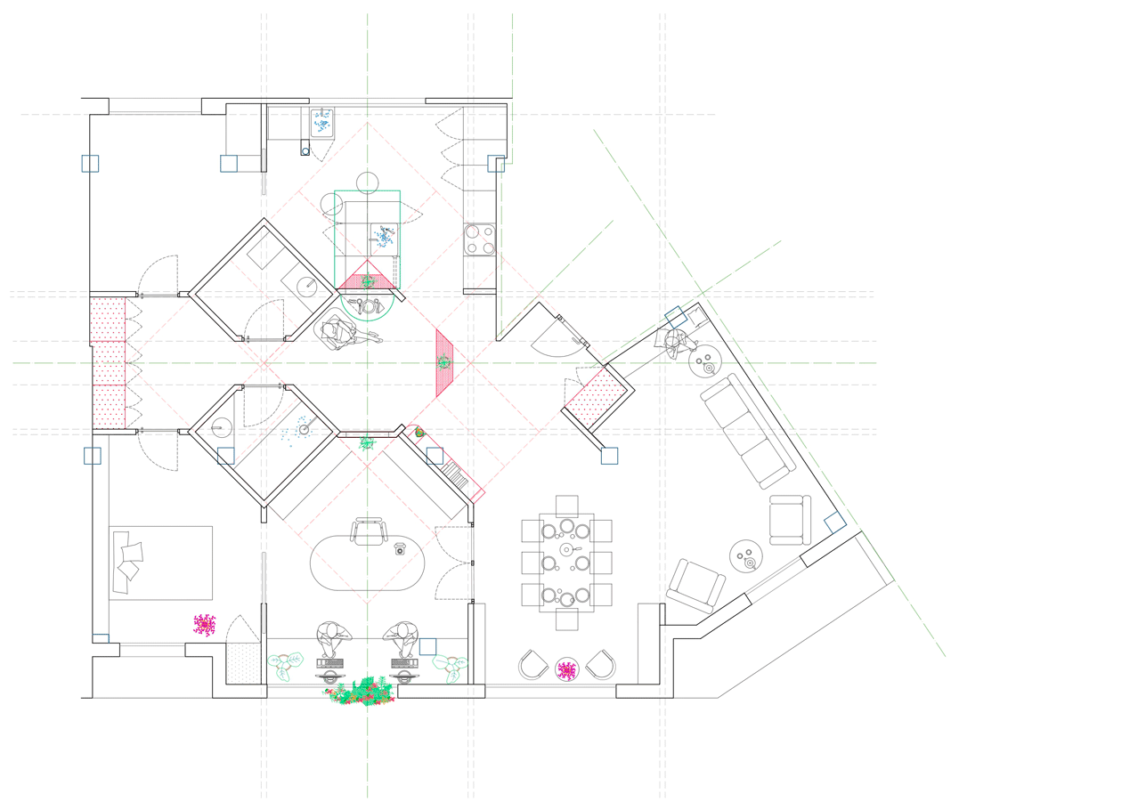
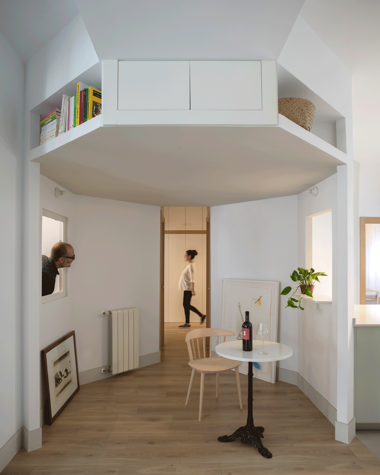
The geometric traces marking the access were the starting point to place a polygonal piece in the center of the house, that allowed to articulate different spaces around it, like a kneecap.
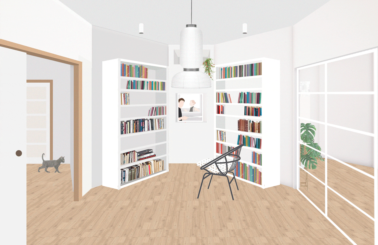
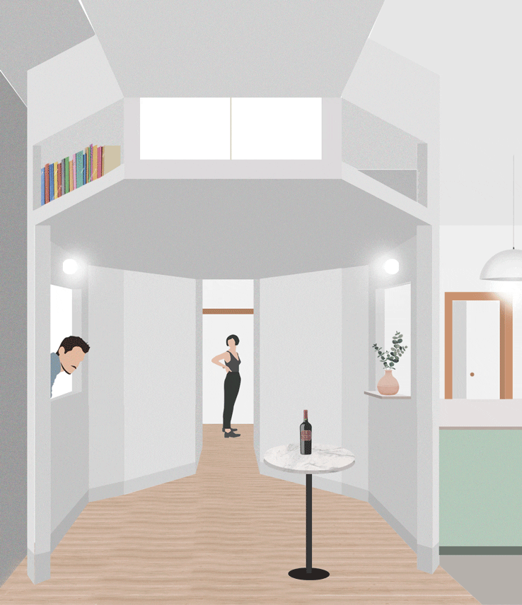
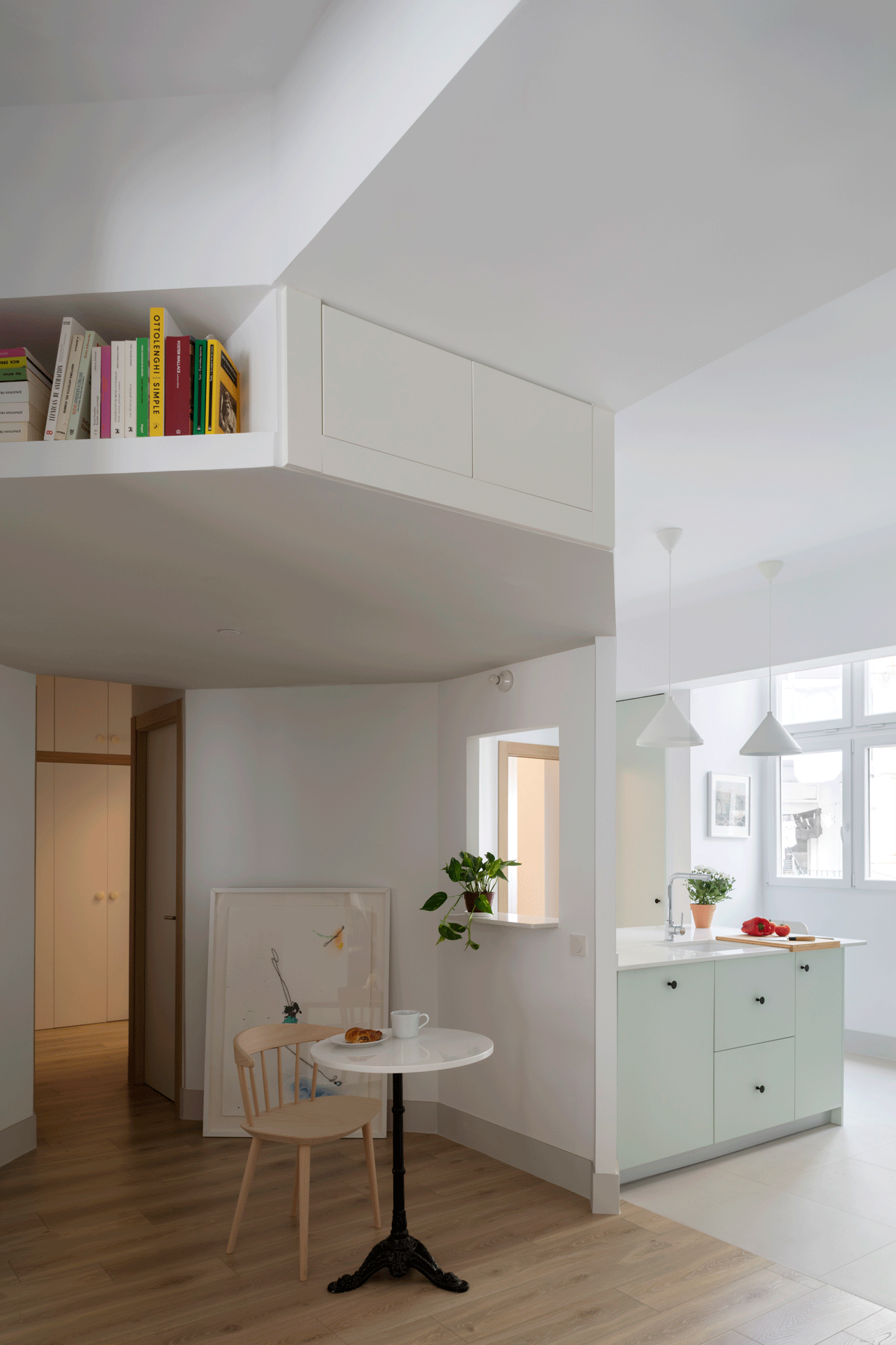
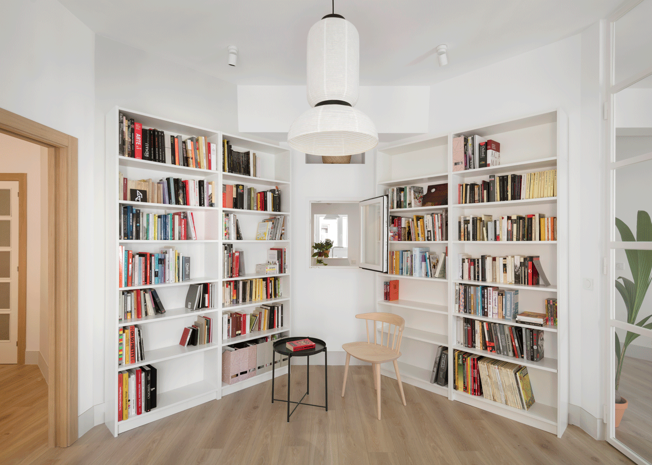
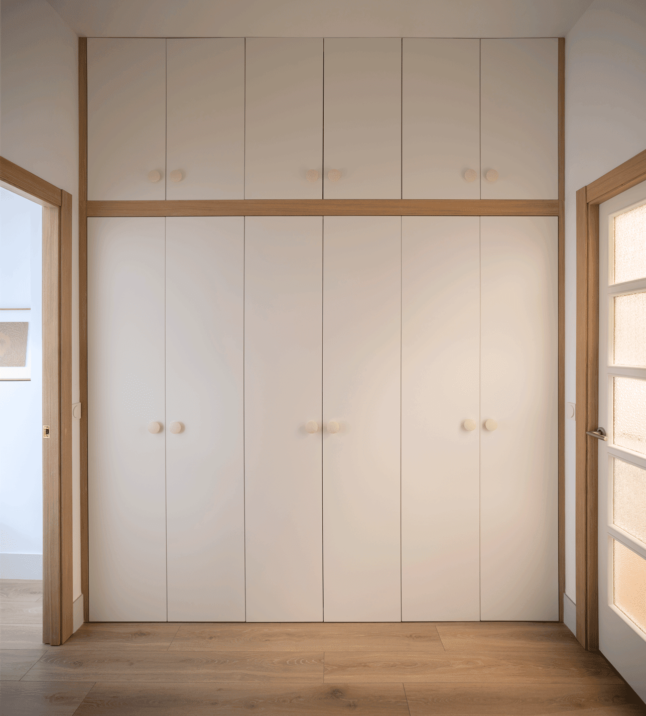
This polygonal piece, specifically an octagon, beyond being a mere piece of distribution or passage, becomes a place to stay or meeting, in which the unexpected happens. Next to it there are two closed pieces, the only ones with a single access, with a shower and a toilet, to allow simultaneous uses. From here, a small hall with cabinets to free the rooms and to allow them to have different uses depending on the needs to come. Other pieces of storage appear in those indeterminate spaces, which are either cabinets or shelfs.
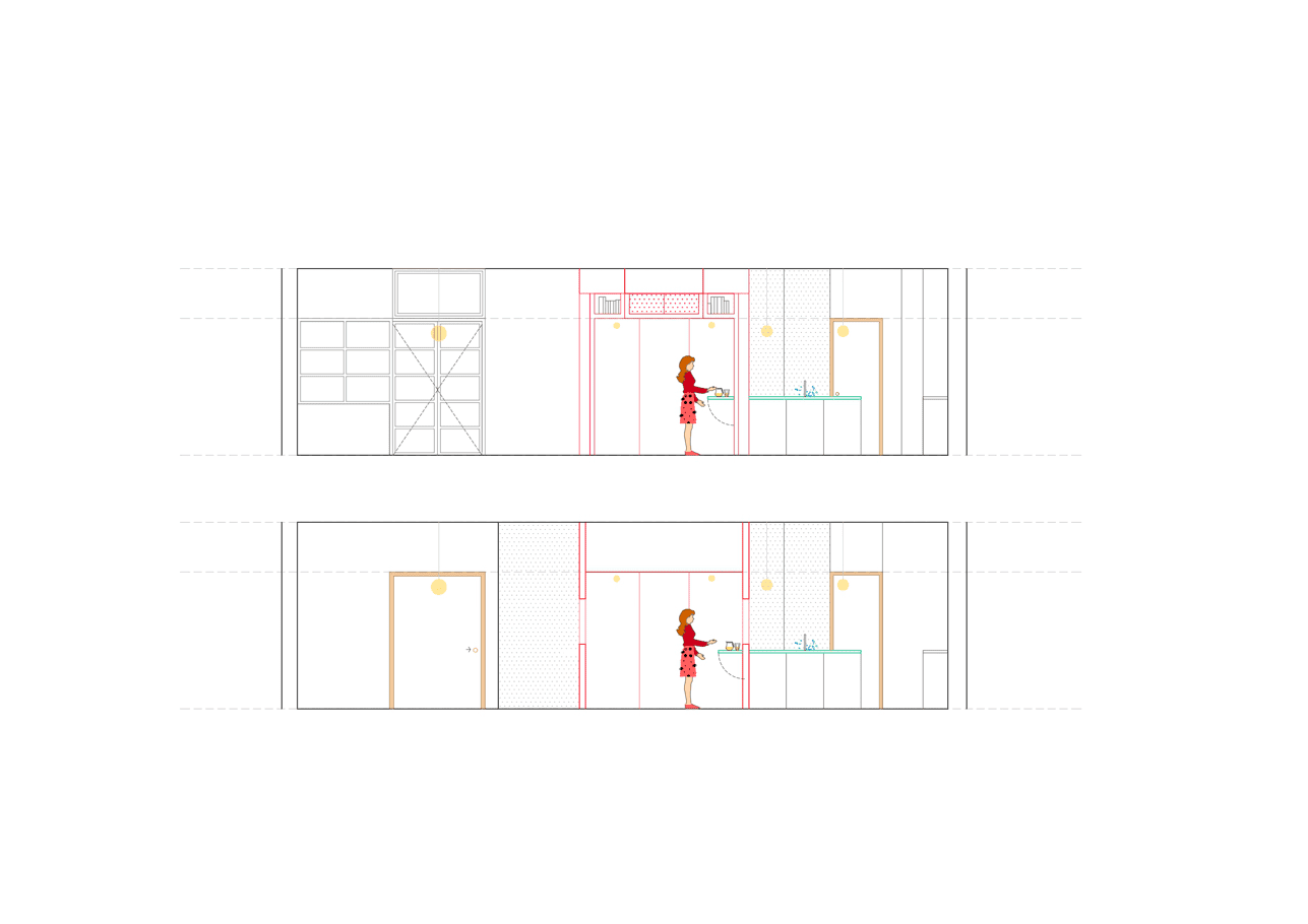
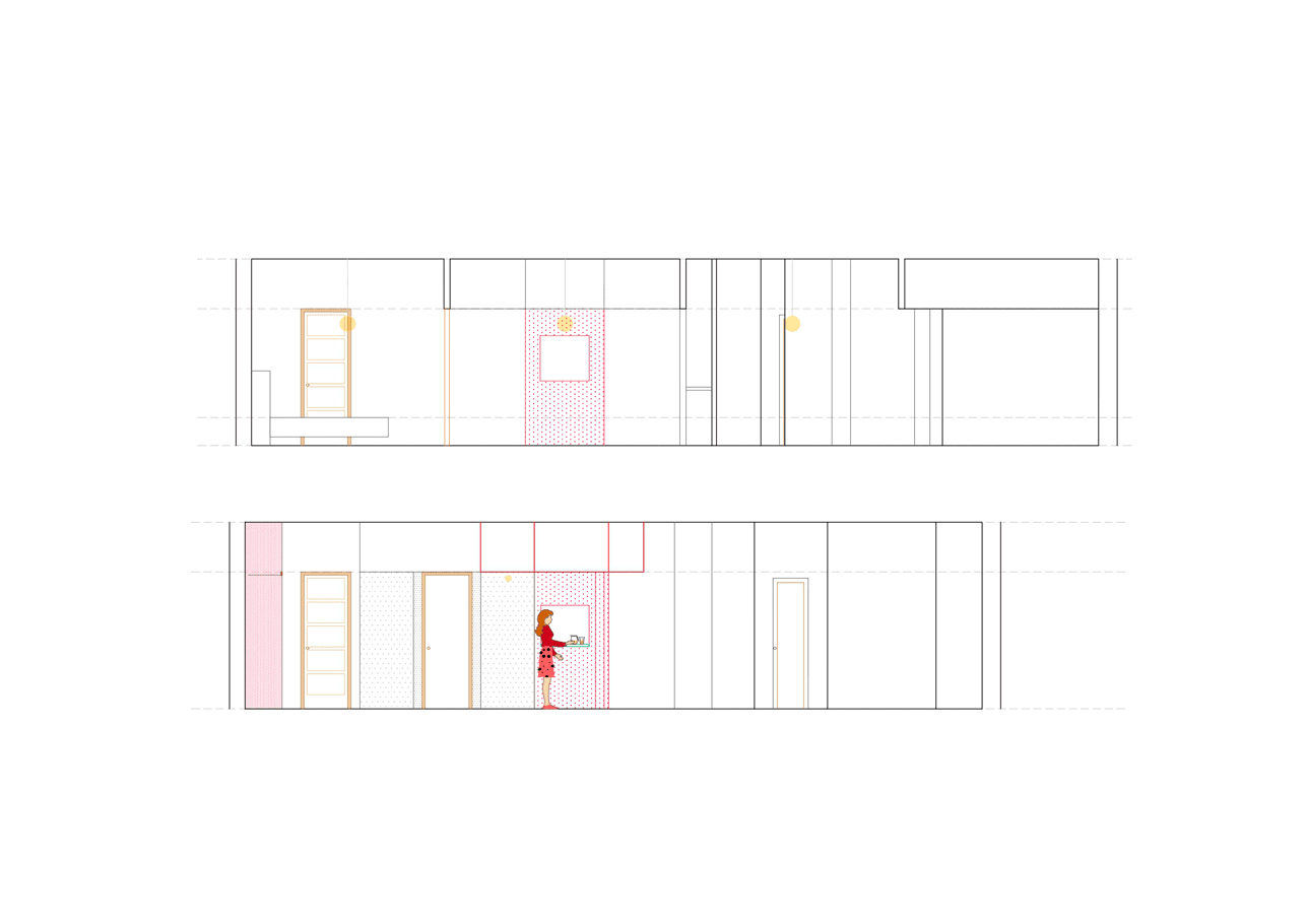
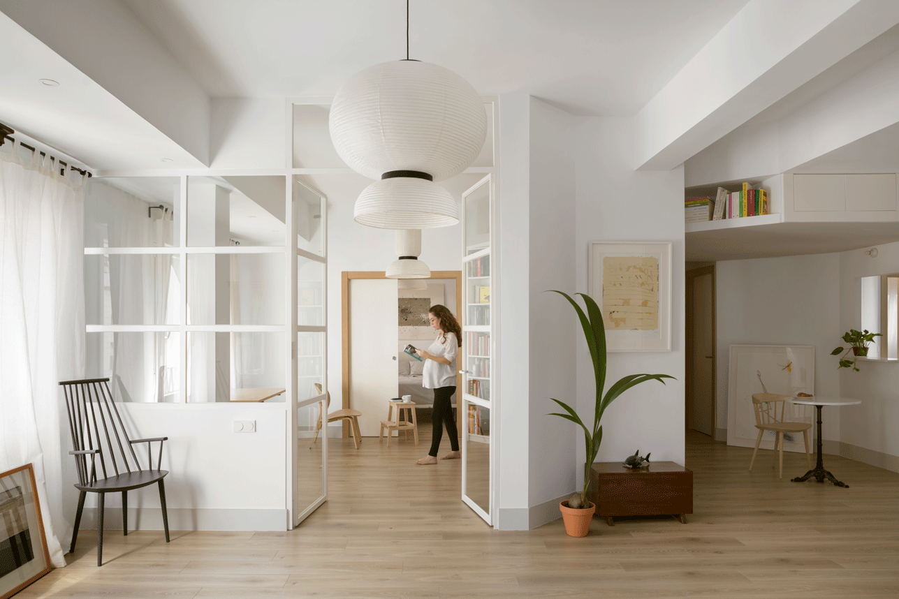
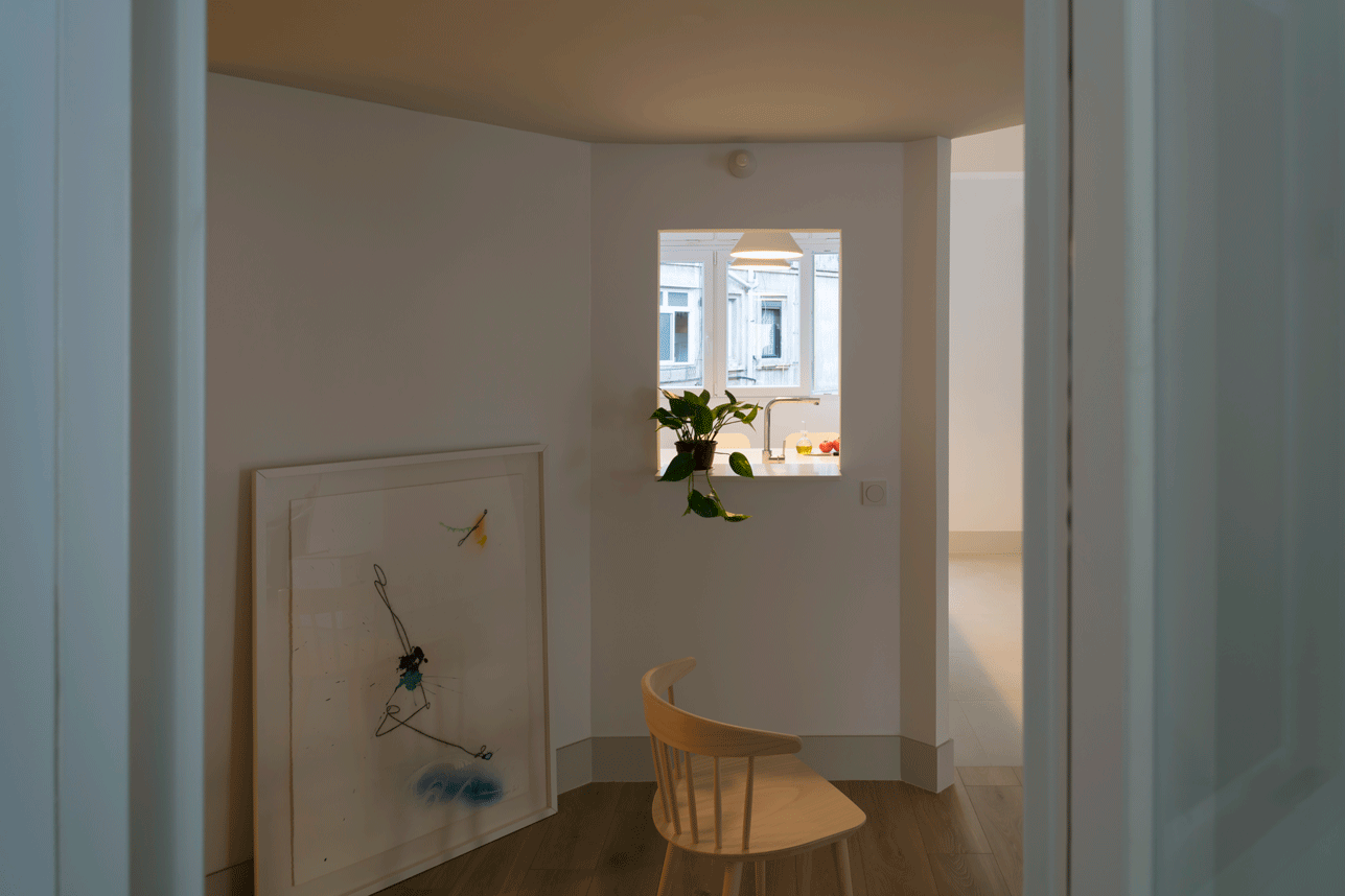
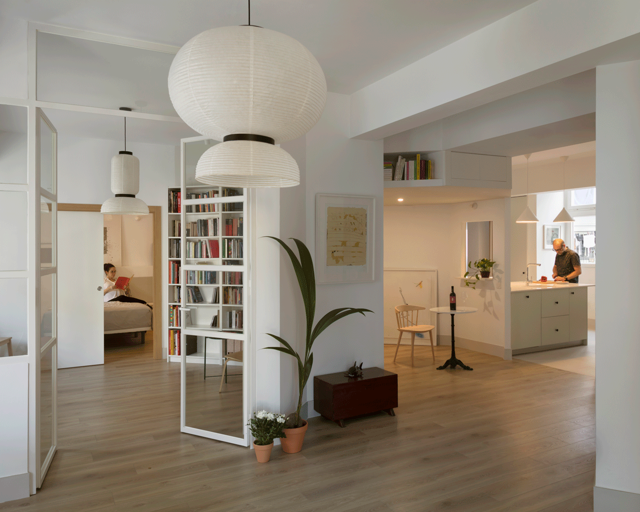
The succession of pieces in enfilade on the facade lengthens the perspective of the rooms and gives more spaciousness to the spaces. The windows that open toward the octagon, or the several doors that allow the access to the rooms create multiple longitudinal, transversal and diagonal axes. The pass-through window between the kitchen and the octagon turns this ambiguous space into an extension of the kitchen, allowing breakfast or a cup of wine on both sides of the window.
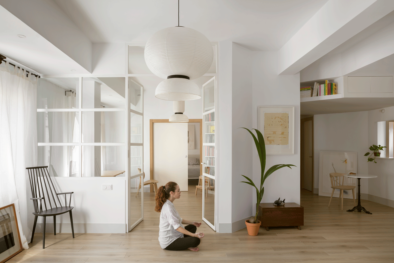
All the pieces are connected to each other, and turn around the central piece, which enables to be crossed in its perimeter, to multiply the visual and spatial relations, and also to provide crossed ventilations and being a cool house in the summer or to allow all the spaces to be illuminated in a natural way.
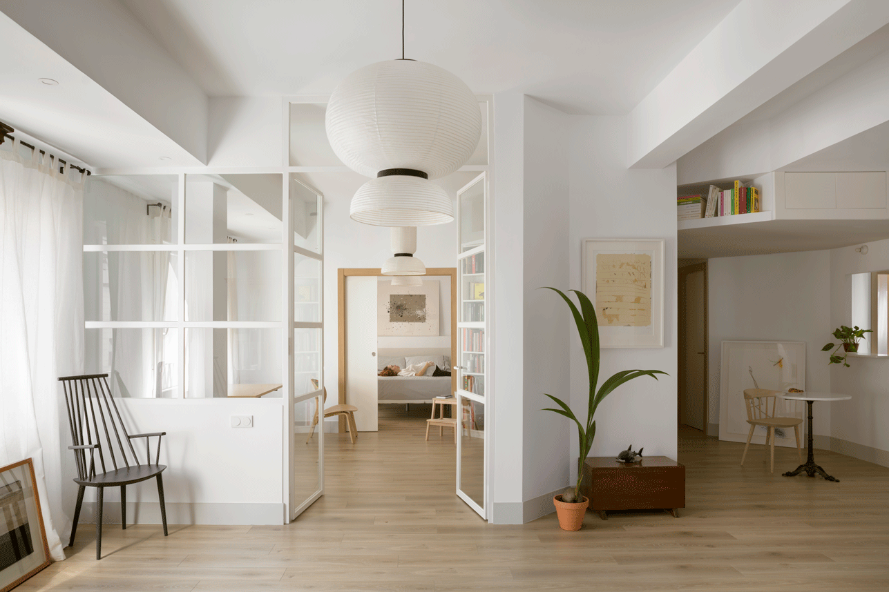
Finally, the material proposal aimed the idea to perceive the house as a unit. So, sobriety and uniformity in the choice of materials was the way to follow. Subtle details recall the pre-existence: doors recovered with frosted glass or a concrete column left exposed. Slight wooden details as knobs and flashings together with elements in green colour consciously break the homogeneity to redirect the look without stridencies.

